The 2014 Winter Olympic opening ceremonies were decent, seeing medals handed out in team figure skating, moguls, snowboarding are alright, sure... but let's be honest, the main attraction every four years doesn't start until Wednesday night, when the men's hockey round robin tournament gets underway.
It should be a helluva opener, the Czech Republic takes on Sweden in a battle of two of hockey's most talented teams, while two underdogs in the Swiss and Latvia go at it in the undercard.
While we wait for the games to get started let's take a trip through each pool to see what the twelve men's Olympic hockey clubs will be wearing these next two weeks. As was the case in the last four Olympics, the design team at Nike was responsible for each uniform and incorporated similar elements across every one of the teams, sublimated lacing and patterns on the shoulders for example.
In some instances below we've used photos of the women's teams in action - this gives you a look at how the full uniform: jersey, pants, socks, look together in action, the men's side will be wearing the exact same designs as the women.
POOL A
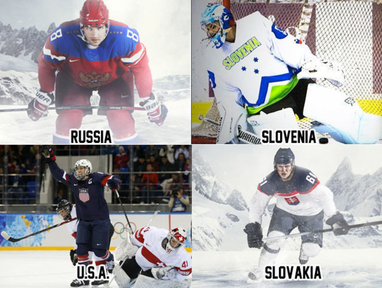
Pool A might be the best dressed pool of the tournament. The host Russians lead the way with their always fantastic uniform with eight stars (four on each shoulder), the eight stars represent the gold medals won in hockey at the Olympics by the Russians (7 as USSR, 1 as the Unified Team). Russia also has a white version of this uniform which features the double-headed bird formed in the negative space on the chest, eight crowns up the sleeves for their eight golds on this one.
The Americans go with a more traditional look, using a simple shield design with "USA" above red and white vertical stripes. Their two previous gold medals are noted on the inner collar, which the players will see every time they pull the jersey over their heads before a game.
Slovakia uses a similar design as the U.S. side, a navy blue, red, and white design with their national shield logo on the chest. Like Russia and the Americans, this uniform has a somewhat-hidden nod to the nation in the design, the lyrics to their national anthem are printed all over the jersey in a color very similar to the base rendering them nearly invisible at a distance.
Slovenia was not expected to make this tournament, 2014 will be their first ever appearance in the Winter Olympics for hockey and their highest place ever in a world tournament was 13th back in the 2005 IIHF World Championships. Their uniform will certainly be the most noticed with it's bright blue and neon green color scheme, the design is quite similar to their national soccer team look.
POOL B
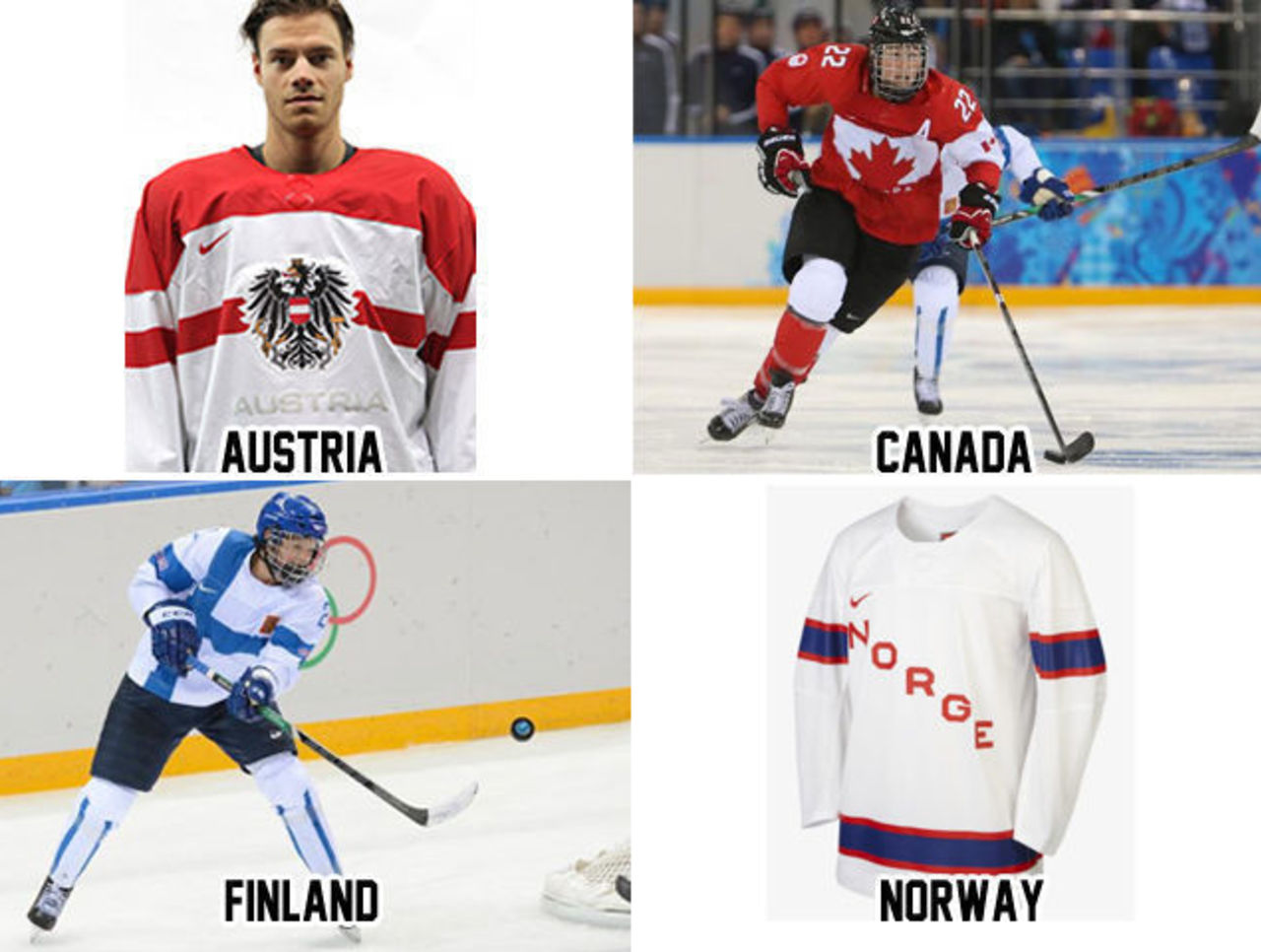
Pool B sees two of the three red-and-white designs with horizontal stripes across the chest. Real creative there, Nike. Austria is the first, with their national shield on the chest above "Austria" in a barely-visible sublimated white text.
Defending gold medalists, Team Canada's uniforms were oft-criticized upon their unveiling, but they're really not that bad folks. My biggest gripe with their look is the socks, which is something the guys at Nike have a hard time with as you'll see a few times here. I'd also like to see a little less black in the uniform, Canada's a red and white nation, they should be as red-and-white as possible. Canada's past Olympic hockey success is featured by way of a pyramid of 12 golden leaves, one for each mens, women's, and Paralympic hockey gold. Good luck telling the teams apart when Canada and Austria face off, I'd be surprised if Canada didn't wear their black alternates for that one.
I love the concept behind Finland's giant flag uniform, I'm just not sure it translates well to a hockey jersey... it would work well for soccer. Finland also has a double blue jersey which is much more traditional to their looks of the past. Worst part of this set? Yup, the socks... why can't they just get a normal looking hockey sock design?
Norway rounds out the pool and their uniforms are pretty bare bones, Norge (the local term for Norway) goes diagonal across the jersey New York Rangers style with simple sleeve and waist stripes. They may seem boring, but this is a lot more in line with how a hockey jersey *should* look, they just needed a better way of representing the country via the crest.
POOL C
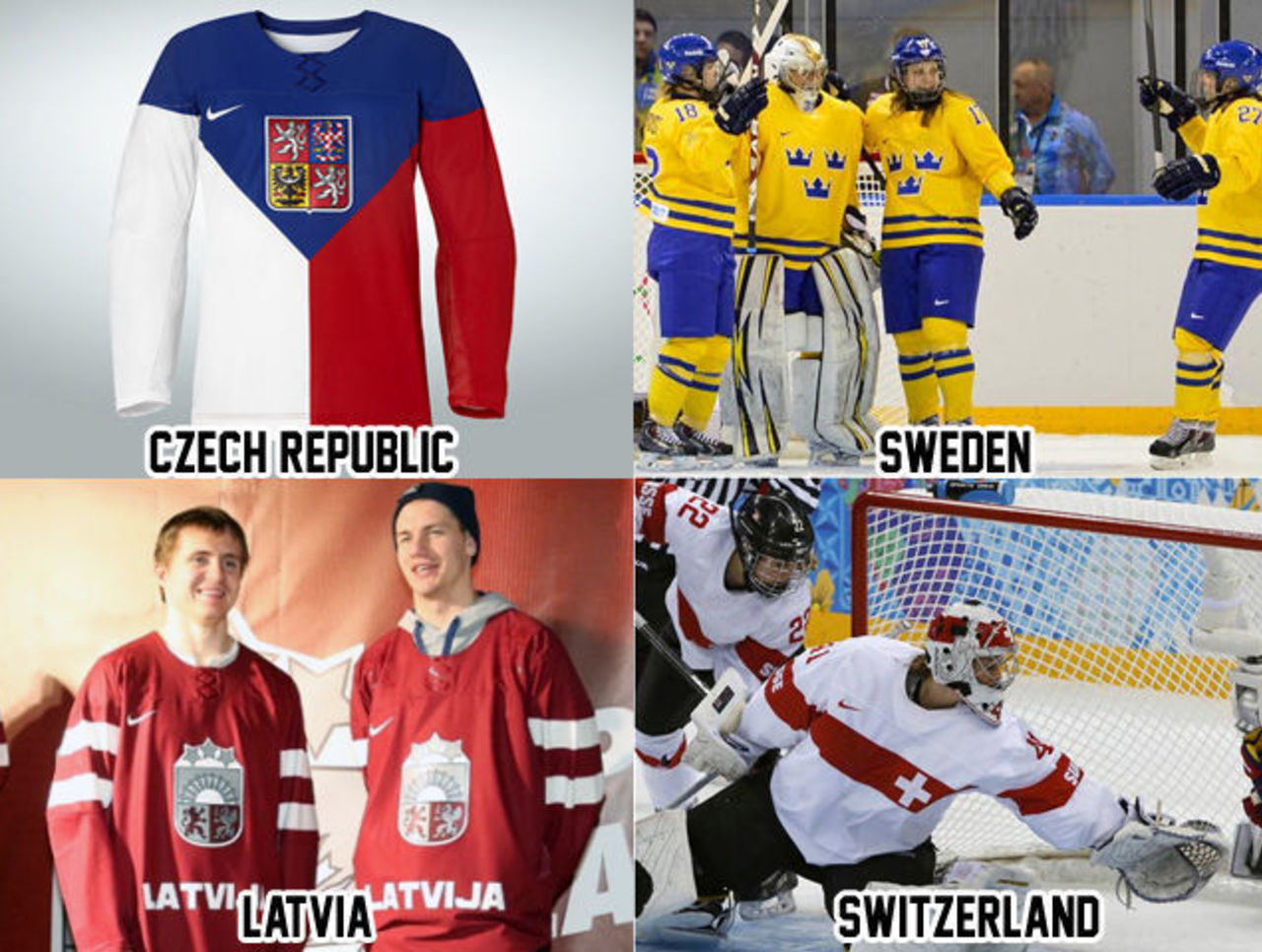
This is certainly the most diverse of the pools with every team in a unique color scheme and design. The Czechs, like Finland, get the full-flag treatment on their jersey, again like Finland I'm a fan of the concept but not the result. I do have concerns about how this jersey will look on-ice in-action and if there will be issues with one half of the jersey red while the other is white, especially when they're most certainly up against a white opponent every time this is worn. The Czechs also have a white version of this jersey, which uses the same shield on the chest with red shoulders.
If the tournament was decided by best looking uniform, Sweden wins the gold. The story goes that Nike pressured the Swedes to go with a more modern look only to be shot down by those in charge of Sweden's Olympic Team over-and-over again. Brilliant. Sweden loses points for their lack of sleeve stripes, but that's still not enough to push them out of top spot.
Latvia wears the maroon and white of their national flag while using their national shield on the chest and country name below, there are no waist stripes, and the sleeve stripes kind of mimic their flag. Like Canada, the Latvian team compliments their two national colors with black, which they'll wear on their pants and socks. If you swapped out the "LATVIJA" on the waist with a couple of stripes and you've got a much better lookin' jersey there.
Speaking of Canada... Switzerland. The Swiss uniforms are red, and white (like their square flag) with black pants. There's a horizontal stripe across the front of the jersey with the cross, from the flag, on it. Basically these are the same uniforms as Team Canada with the Swiss Cross in place of Canada's maple leaf.
We should also take a look at the other two nations Nike made hockey uniforms for, the two participating only in the women's bracket.
WOMEN'S ONLY TEAMS
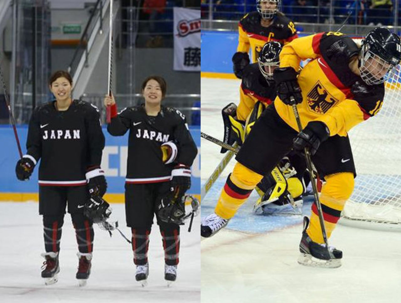
Team Japan disappoints with their uniforms, not only is the use of the English version of their name confusing, but so is the black-dominating color scheme not to mention the ridiculous Nike sock... look at those things, vertical red stripes all around the sock? How hard is a couple of horizontal stripes. C'mon now.
Germany is the other womens-only hockey club in these games, the polar opposite of the Japanese uniforms, very heavy in the national symbolism draped in their national colors of black, red, and yellow (with the unintended side effect of resembling those old Vancouver Canucks teams of the 1980s). Socks look great, but sleeve stripes and waist stripes are missing. Overall a good looking team.
All in all, in my opinion, a disappointing crop of uniforms this time around, I'll hold out hope that someday we return to an era when each nation designed their own uniforms. I think I'll be waiting a while.
Chris Creamer is the creator and editor of SportsLogos.net. You can follow him on twitter at @sportslogosnet.


