They wrote the book on NHL logos. These are their all-time favorites
Earlier this week, theScore explored the writing and release of "Fabric of the Game," Chris Creamer and Todd Radom's deep dive into the history of the names and logos of every NHL team - plus 15 bygone franchises and the Seattle Kraken.
In a recent interview, the authors identified their all-time favorite NHL logos and broke down the design characteristics that make these emblems so appealing. Each expert's top five choices are listed alphabetically below, and their analysis follows.
Creamer: Buffalo Sabres, Colorado Rockies, Detroit Red Wings, Hartford Whalers, New Jersey Devils
Radom: Atlanta Flames, Boston Bruins, Minnesota Wild, Philadelphia Flyers, Winnipeg Jets (original)
Atlanta Flames
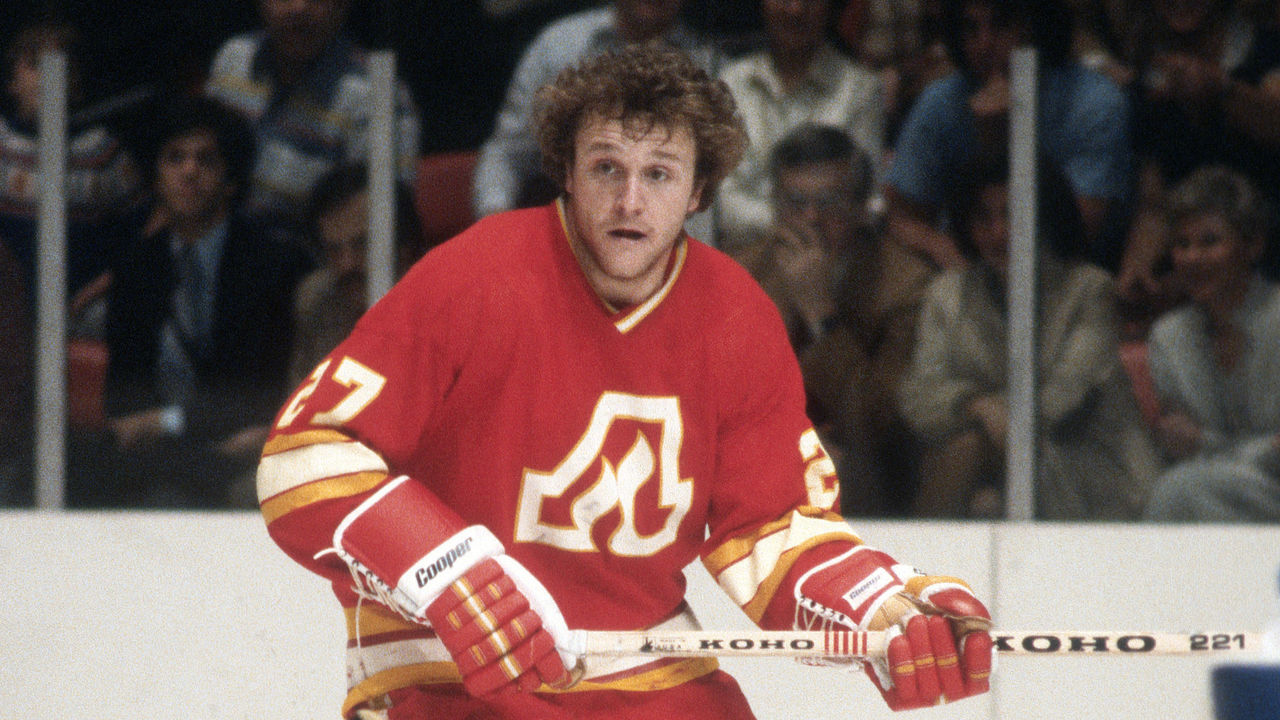
When new, Canadian ownership whisked this franchise north to Calgary four decades ago, the Flames' uniforms retained a dash of Atlanta: the Coca-Cola shade of red native to the soda giant's home city.
The simplicity and coherence of Atlanta's flaming "A" logo have long stuck with Radom, a renowned graphic designer: "It conveys a lot with a little, which is always my criteria."
Radom was 16 when, in 1980, he attended one of the Flames' first games as a Calgary-based team and came to appreciate the "C" variant on its own merits. It's just that the "A" set a high standard.
"Once you've seen the 'A' with the flame right in the middle, (the 'C' isn't) quite as elegant," Radom said. "But listen, 40 years on, the Flames are not only wearing them but reverting back to that original look. It holds up."
Boston Bruins
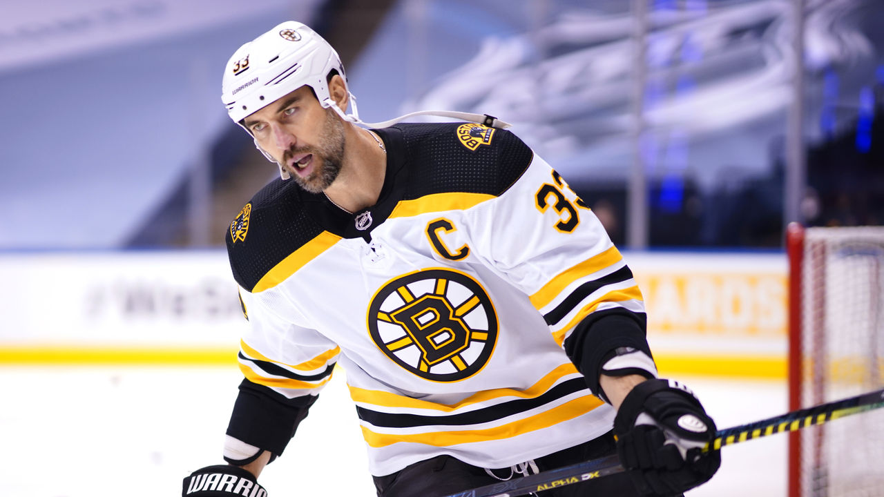
"Fabric of the Game" dispels a well-worn tale about the Bruins' spoked "B": that the logo was designed in 1948 to assert Boston's status as the "Hub of the Universe," a voguish nickname for the city in the 19th century. The authors' research turned up no corroborating evidence, though Radom said they're still on the lookout.
Setting aside what the "B" isn't, Radom finds it easy to value what the mark is. It's solid, includes arresting colors, and remains faithful to the 72-year-old initial design despite minor font and outline tweaks. Badass teams donned the "B" in the 1970s, Radom said, and today, historical consistency begets instant recognition.
"They look like the Bruins," Radom said. "You flip on a game, look at your screen: They are the Bruins."
Buffalo Sabres
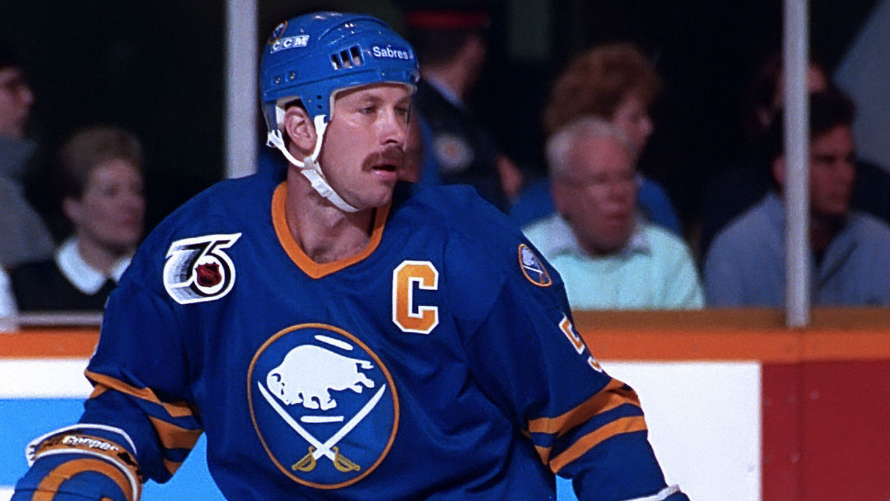
"Extraordinarily clever" is how Creamer, the editor of SportsLogos.net, describes the balance Buffalo struck with its 1970 expansion logo. The jersey crest features a buffalo and crossed sabers. "It says it all," Creamer noted. Chef's kiss. 'Nuff said.
Why meddle with perfection? Seymour Knox III, the Sabres' founding owner, voiced that sentiment during the mid-1990s rebrand that completely changed the club's appearance. If Original Six teams don't overhaul their logos, he argued, Buffalo shouldn't feel the need, either. Only in 2010 did the Sabres ditch the maligned "Buffaslug" to revive the original design, vindicating Knox 14 years after his death.
Next season, the crest will again be royal blue rather than dark blue, completing the return to roots.
"We can look back on this now and think, 'This guy was onto something,'" Creamer said of Knox. "If only he could see what's happening now."
Colorado Rockies
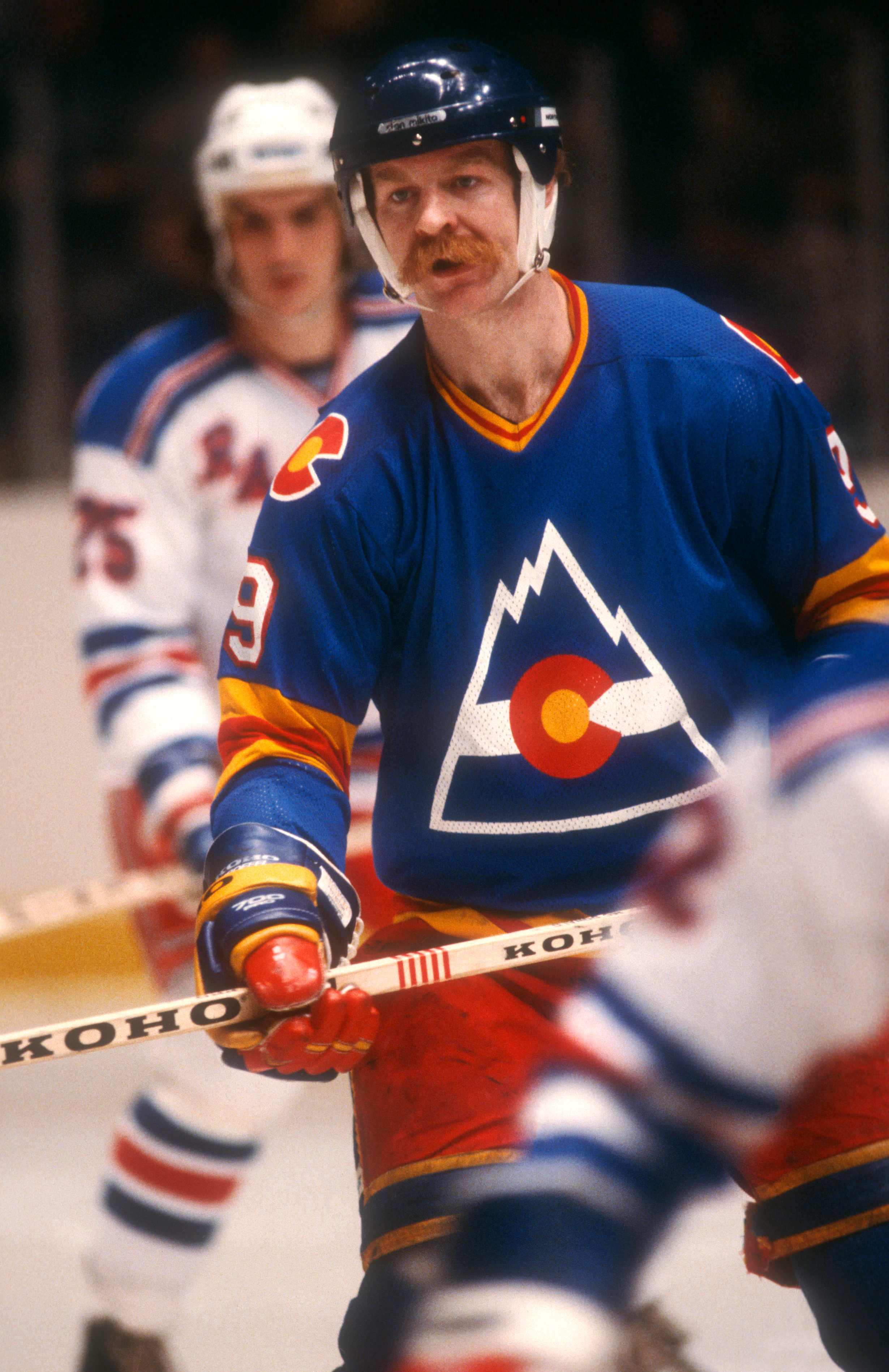
It's Creamer's belief that blue-red-yellow color schemes should get far more play across North American sports. The NCAA's Kansas Jayhawks swear by such a pattern. The same goes for the NBA's Denver Nuggets, though red isn't paramount in their motif.
From 1976-82, before the Rockies moved to New Jersey and an expansion MLB team picked up the name, this NHL club rocked a tricolor, white-striped Rocky Mountain logo crafted in the image of Colorado's state flag.
"An amazing, remarkable thing to do," Creamer said, praising the decision to meld two signature state symbols.
It's only fitting that the Colorado Avalanche, recognizing their heritage, now trot out a similar mountain icon as an alternative logo.
"In the wrong colors, but still," Creamer said.
Detroit Red Wings
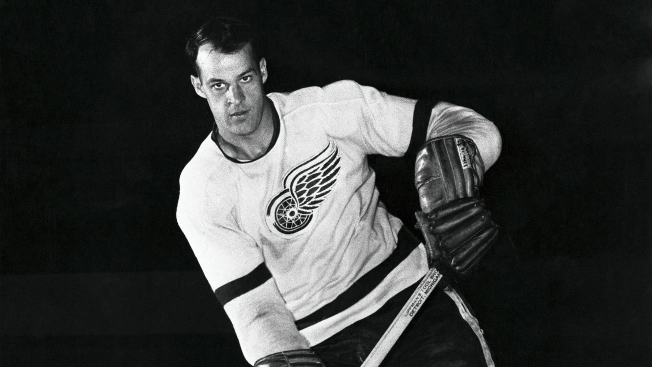
As with the Bruins, Creamer applauds Detroit for riding with the same logo through the eras. Save for the occasional cosmetic update, no one has touched or sullied the winged wheel that Ted Lindsay, Gordie Howe, Steve Yzerman, and Nicklas Lidstrom each sported in turn.
Longevity is one thing, but how's this for added historical significance: Detroit's famous emblem is a tribute to the first winners of the Stanley Cup, the amateur Montreal Hockey Club's "Winged Wheelers." That outfit lifted the chalice in 1893, a full 115 years before the Red Wings celebrated the most recent of their 11 titles.
"To me, that alone - the history attached to it, to the origins of hockey - make it one of the greatest logos in the NHL," Creamer said.
Hartford Whalers
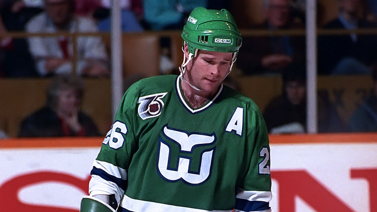
Creamer named his top logos in no particular order, but this one might be his favorite, partly because of a childhood lesson his dad imparted. He recalls browsing old sets of Upper Deck hockey cards and mocking team insignias he didn't understand, Hartford's trademark whale tail among them.
He'd never noticed the hidden green "H" just above the Whaler "W." When his dad pointed this out, it was a lightbulb moment for Creamer - the realization there's more to some logos than immediately meets the eye.
The whale tail is at once nuanced and straightforward, he said, not to mention pleasantly colorful. It depicts the franchise's identity through an illustration a kid could replicate.
What else explains the logo's enduring charm?
"The team doesn't exist anymore," Creamer said. "That doesn't hurt."
Minnesota Wild
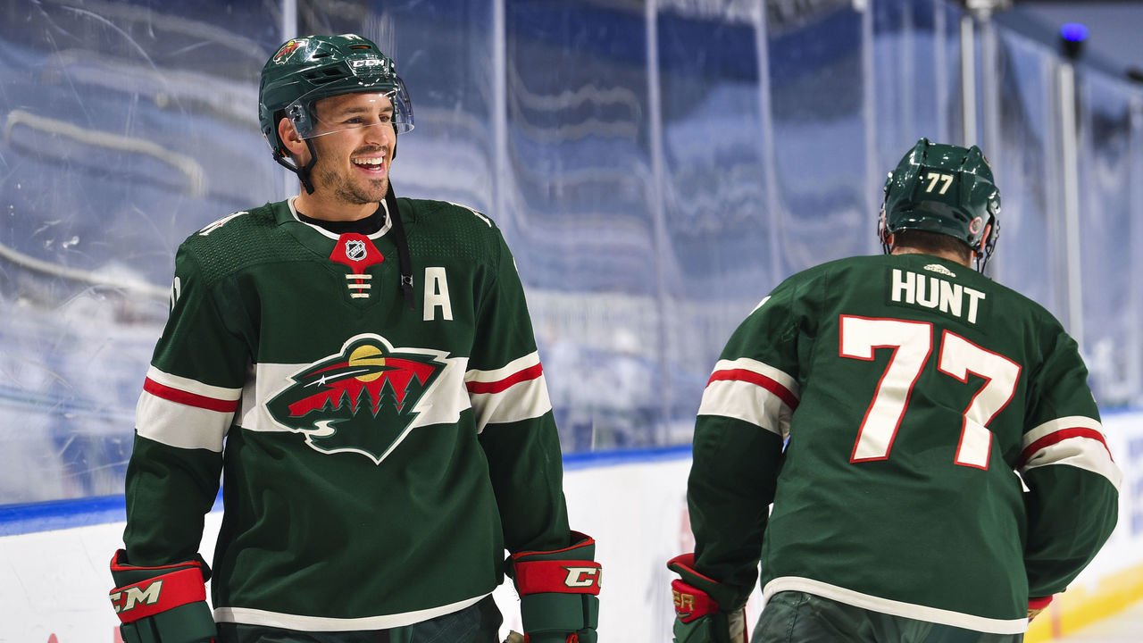
"How do you embody something that is a Wild?" Radom wondered when this franchise settled on a name in the late 1990s. Unlike a saber or a whaler, unlike a flame or a mountain range, Minnesota saddled its designers with an abstract muse: something rugged or picturesque, sure, but without a readymade or obvious form.
Happily, Radom said, the end product nails the look and feel of venturing off the grid in the State of Hockey: "It takes you to a certain place."
At the top of the logo, the sun sets above green trees and a handsome red sky. A river winds into the forest from the bottom right corner. The scene unfolds within the contours of an animal head, the creature's eye represented by the north star that salutes Minnesota's first NHL club.
Radom believes the logo has "gained equity over the past two decades," even though the Wild have iced few great teams in that period.
"That's a hard thing to pull off, but they pulled it off," he said.
New Jersey Devils
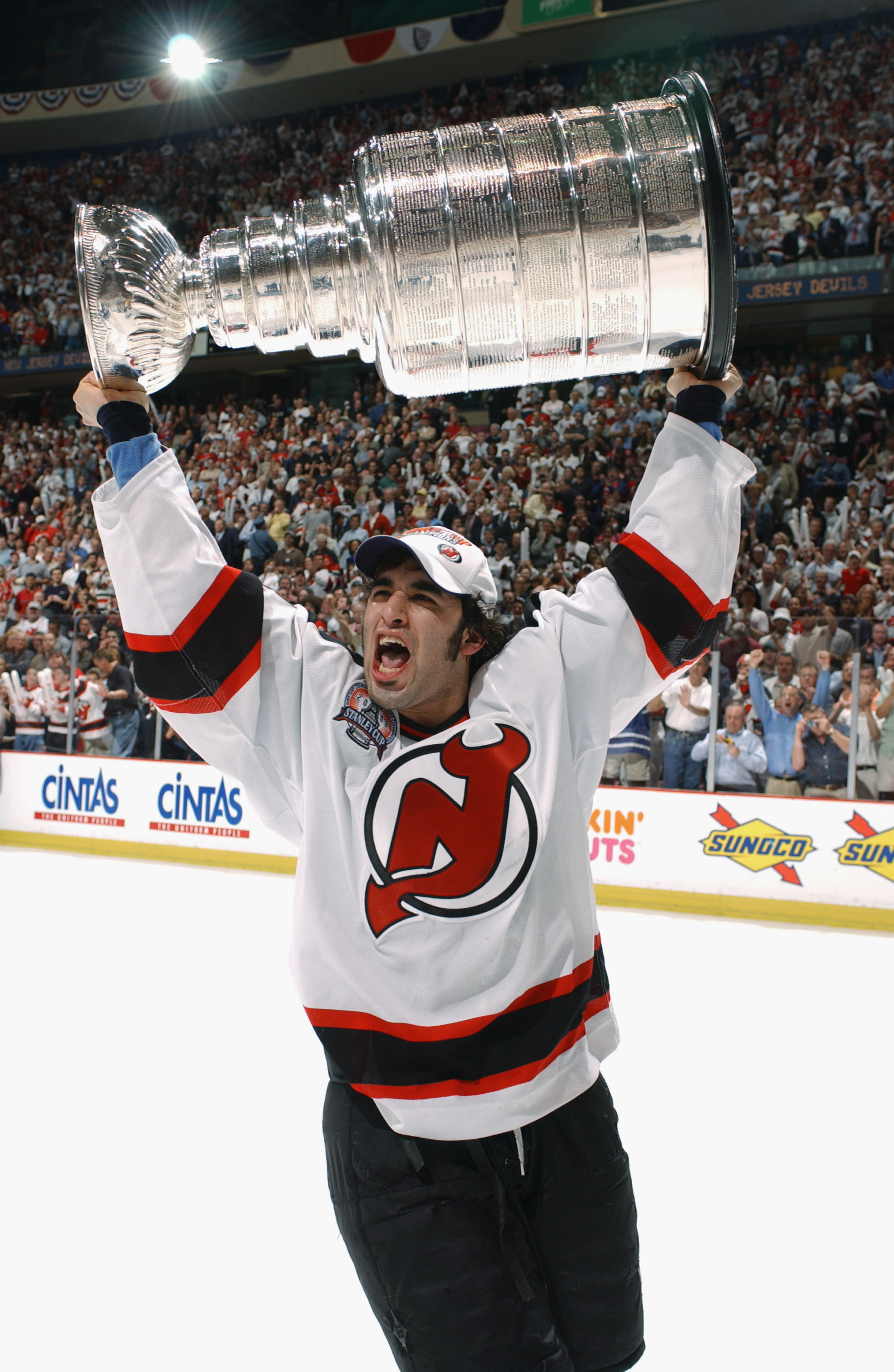
Like Hartford's whale tail, camouflaged "H", and foundational "W", elements in the Devils' logo fuse to produce a harmonious whole. There's power in being direct, Creamer said. New Jersey's creation - interlocked initials that contort into a devil's tail and horns - certainly fits the bill.
The Devils released the mark in 1982, not long before Creamer was born, and the only notable edit in 38 years has been a change in the color of the background circle: a shift from green to black for a more assertive, less Christmassy motif. The organization wore black trim in its three championship seasons, a coincidence that strengthened the brand.
"Some logos are elevated by success," Radom said. "(The Devils) become a little dynasty, and that logo is elevated by virtue of the fact that they have those Stanley Cups."
Philadelphia Flyers
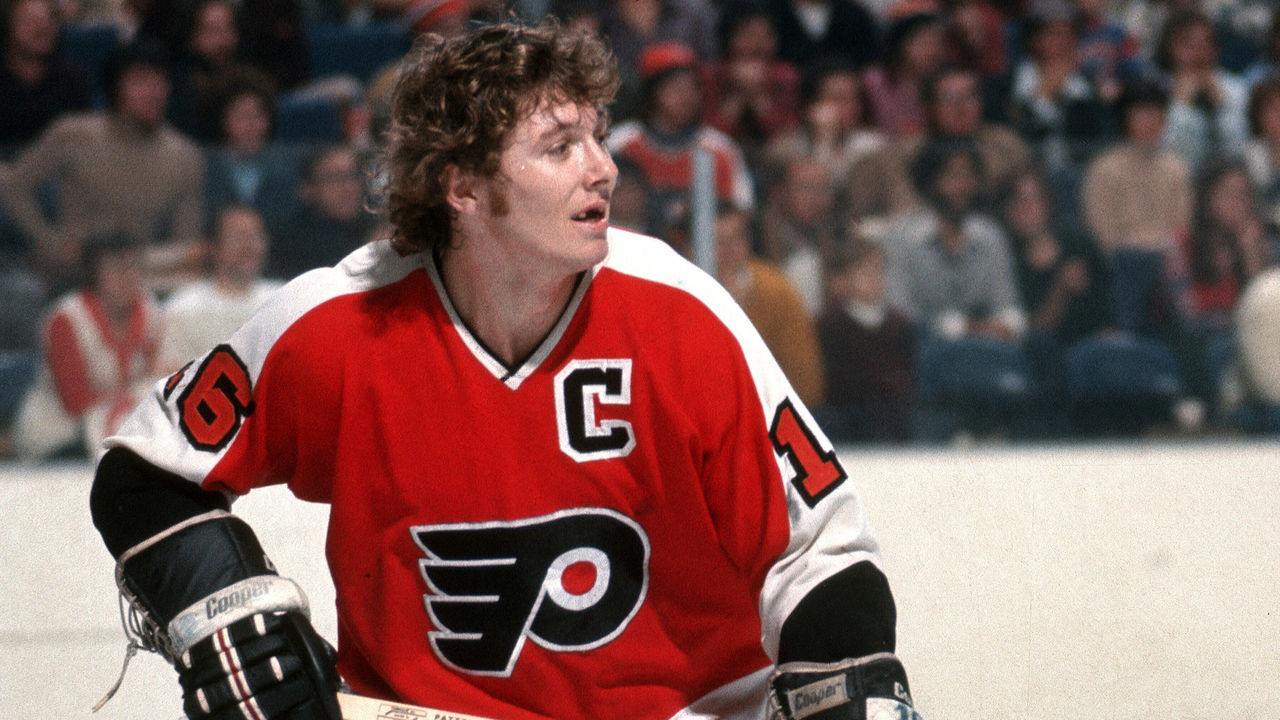
Fundamentally, Radom likes the shapes Philadelphia has used to brand itself since 1967: the slanted "P" that sprouted wings; the central orange dot that imitates a puck. The Flyers helped kick-start the league's expansion era, but their commitment to visual tradition is reminiscent of an Original Six club. Like Boston and Detroit - and unlike Buffalo - they've stayed the course.
Spiritually, Radom has long appreciated that the Flyers wear orange and black, verging off-trend in the cradle of U.S. independence.
"Where 1776 rules all, the Flyers are not red, white, and blue, and there are no stripes or stars," he said.
Apart from brief experiments with silver and gold trim, Philly's logo has remained untouched, its aesthetic distinctive.
"It looks as good now as it did when Bobby Clarke was out there with no teeth," Radom said.
Winnipeg Jets (original)
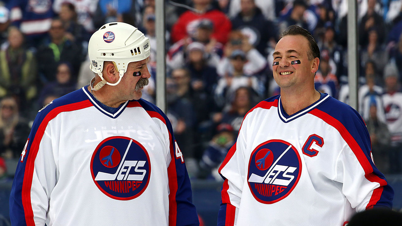
Winnipeg's original hockey team, a three-time World Hockey Association champion in the 1970s, took what Radom characterizes as a "kitchen sink" approach to its emblem.
"It has everything," he said. "It says Winnipeg. It says Jets. It has a picture of a jet. It has a hockey stick. But you put all that together, it's only two colors, and there's something about it that is kind of goofy and '70s."
Those Jets wore the logo in the NHL until 1990. Long after they departed for Phoenix, the current name-holders reprised the style - airplane silhouette and all - for the Heritage Classic in both 2016 and 2019. The tributes looked great, Radom said, and they reminded him of a fond teenage memory: requesting a pocket schedule from the WHA by mail.
"The WHA sent me back these decals, which I still have, all these years later," Radom said. "Among them is this Winnipeg Jets logo. It makes me feel warm inside."
Nick Faris is a features writer at theScore.