Ranking all 7 new NFL uniforms from worst to best
An unprecedented seven of 32 NFL teams will sport new attire when the 2020 season kicks off. The Atlanta Falcons, Cleveland Browns, Los Angeles Chargers, Los Angeles Rams, and Tampa Bay Buccaneers have each unveiled entirely new uniforms, while the Indianapolis Colts and New England Patriots made revisions to unis they wore in 2019.
So, how do the seven new looks stack up? We ranked them from worst to best, but you can tell us which uniform you think is No. 1 in the poll below our rankings.
7. Rams
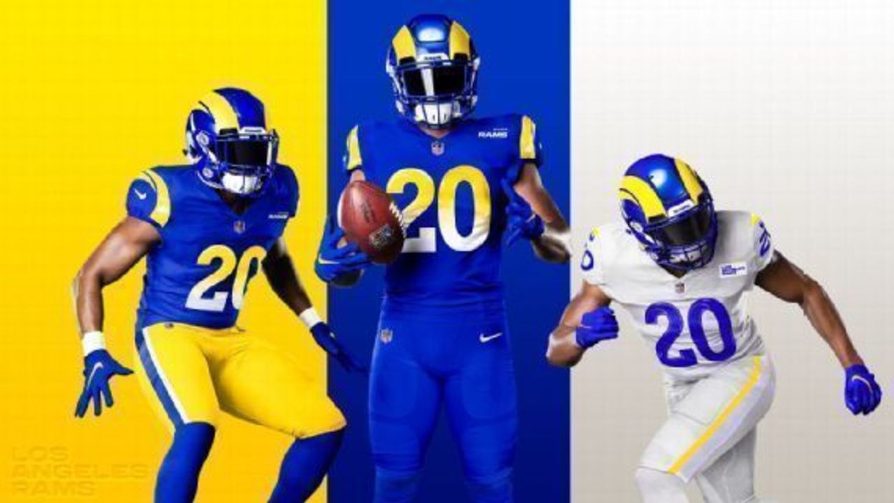
Best element: Return of royal blue and yellow
Worst element: Everything else
All the Rams had to do was take their beloved throwback uniforms and fix the color of the helmets to match the jerseys. Instead, they went way overboard with one of the most bizarre and instantly reviled uniform designs in NFL history.
They get credit for nailing the primary colors, at least. The royal blue and yellow are gorgeous.
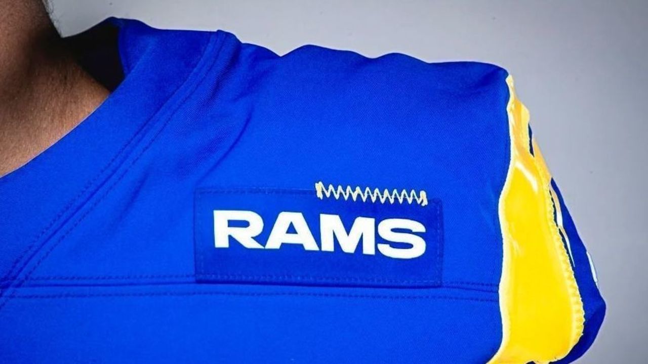
But in all the other details, this design completely fails. There's no good reason for the numbers on the blue jersey to fade from yellow to white in a gradient pattern except so the Rams can claim they are innovators. There's no reason to cut the iconic helmet horn design in half. There's also no reason for the home and road uniforms to feature different shoulder patches, each with inexplicable stitching in the upper right:
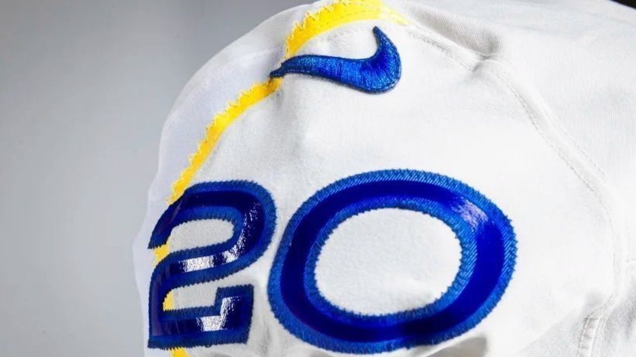
Finally, there's absolutely no good reason to make the away uniform an off-white color the Rams call "Bone" instead of standard white, or for the numbers on the away jersey to shine like plastic while a yellow stripe cut in a zig-zag pattern akin to a kindergartener's art project runs partially behind them:
Even franchise legend Eric Dickerson dislikes the new uniforms, saying they "just look soft" and comparing the revised design of the helmet horns to "two bananas."
He's absolutely right.
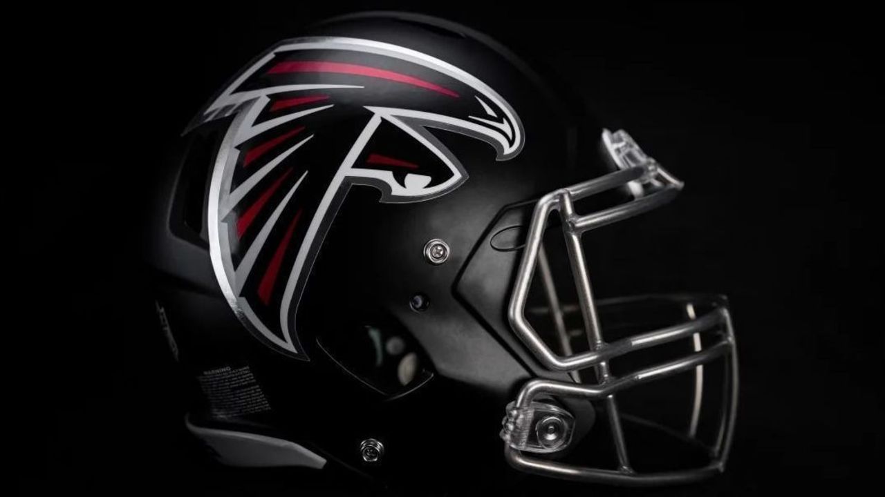
6. Falcons
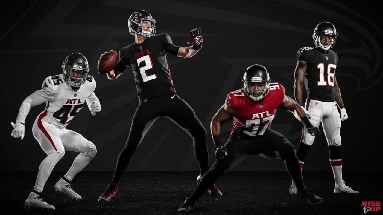
Best element: Matte black helmet
Worst element: Gradient on alternate jersey
The Falcons desperately needed to refresh their dated early-2000s uniforms, but the new design they settled on is all but certain to look dated itself in a few years.
The ultra-modern all-black and all-white combos will surely be favored by players, who seem to believe that the only good uniform is a monochrome one. We prefer a little more variety of colors.
But when we say colors, we definitely don't mean what the Falcons did with their new alternate jerseys. Gradients simply have no place in professional sports aesthetics. Even in the XFL, these red-to-black eyesores would have looked amateurish:
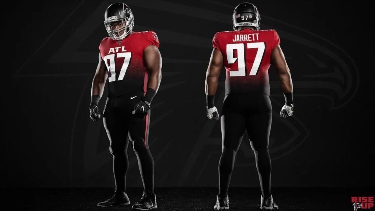
Another nitpick: Did the "ATL" wordmark on the chest really need to be this big?
The one detail the Falcons definitely got right is their helmet, which now features a matte black finish. Matte is overused in football and often ends up looking dull instead of sleek, but pairing it with the Falcons' logo and their new chrome-silver facemask produces a really appealing outcome:
:format(webp):no_upscale()/cdn.vox-cdn.com/uploads/chorus_asset/file/6753895/_17_2.0.jpg)
5. Patriots
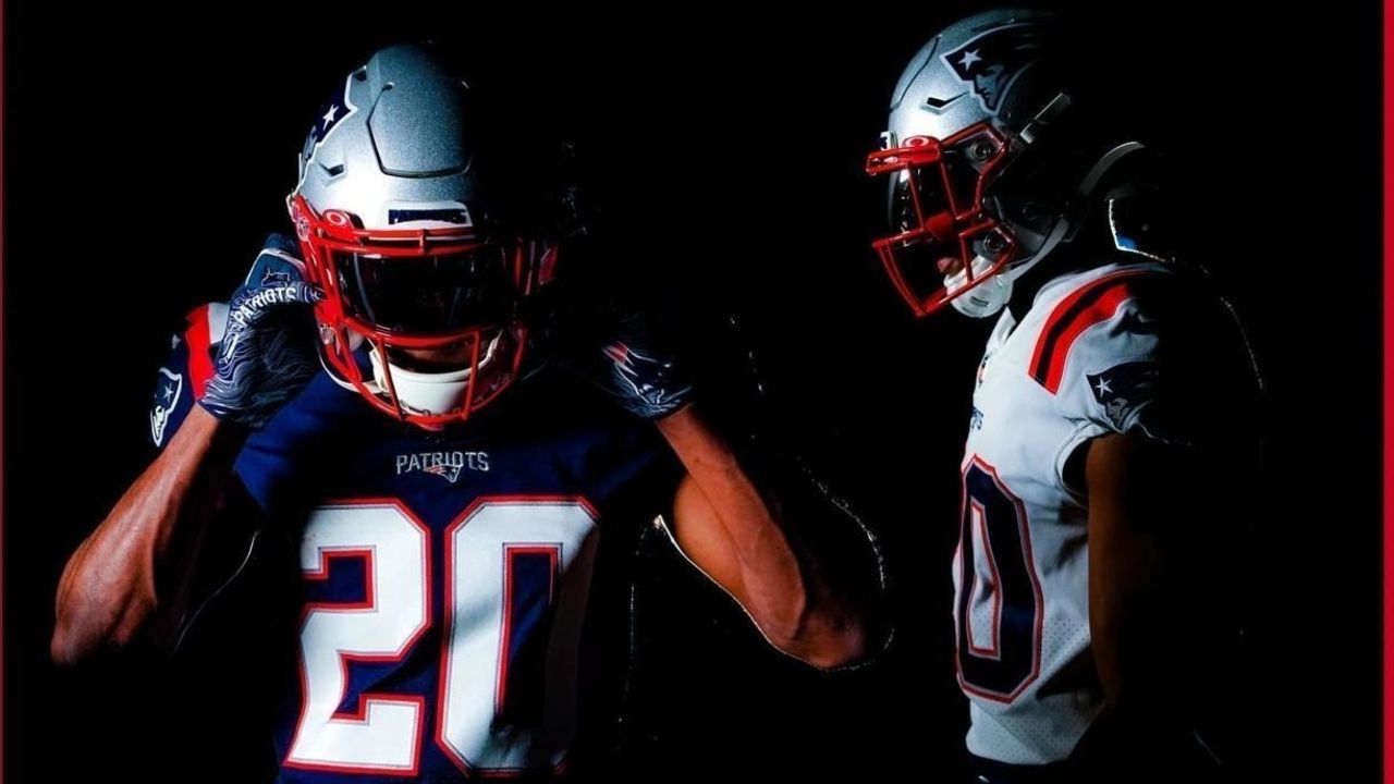
Best element: Simplified striping
Worst element: No silver pants
The Patriots moved on from the Tom Brady era by ... elevating the jersey-and-pants combination that Brady occasionally wore over the past few years as part of the NFL's Color Rush initiative to their new primary uniform. It wasn't exactly a clean break.
While we would've preferred to see a full redesign (perhaps with the fan-favorite Pat Patriot throwbacks as the basis), moving to the Color Rush uniform with a new white version to wear on the road is probably an upgrade over what the team wore before. The simplified striping for the shoulder and pants is more appealing than the previous overdesigned mess was.
The number and nameplate fonts were slightly revised, too, and while the new ones look fine, we actually slightly prefer the older, skinnier numbers and serifed player names. Maybe we just got used to seeing the old ones in big games.
/cdn.vox-cdn.com/uploads/chorus_image/image/63905772/1127200734.jpg.0.jpg)
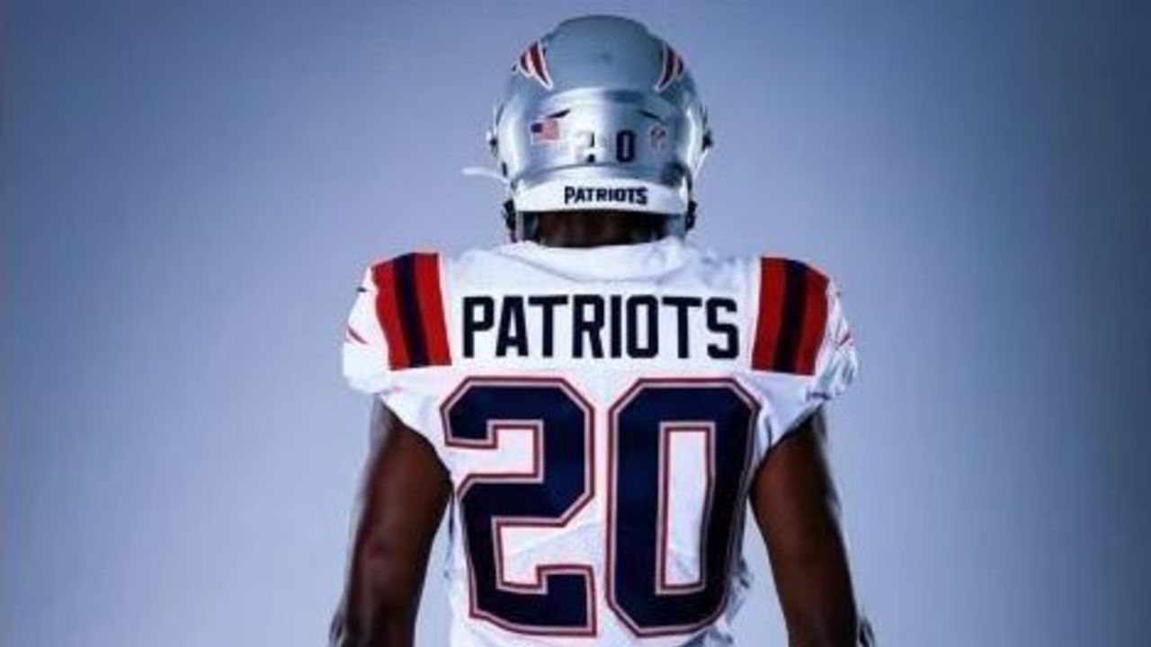
By far the worst detail in the new uniform is the lack of silver pants. In an era when NFL teams mix and match their uniform elements, the Patriots' new set comes with just one color of britches: navy blue.
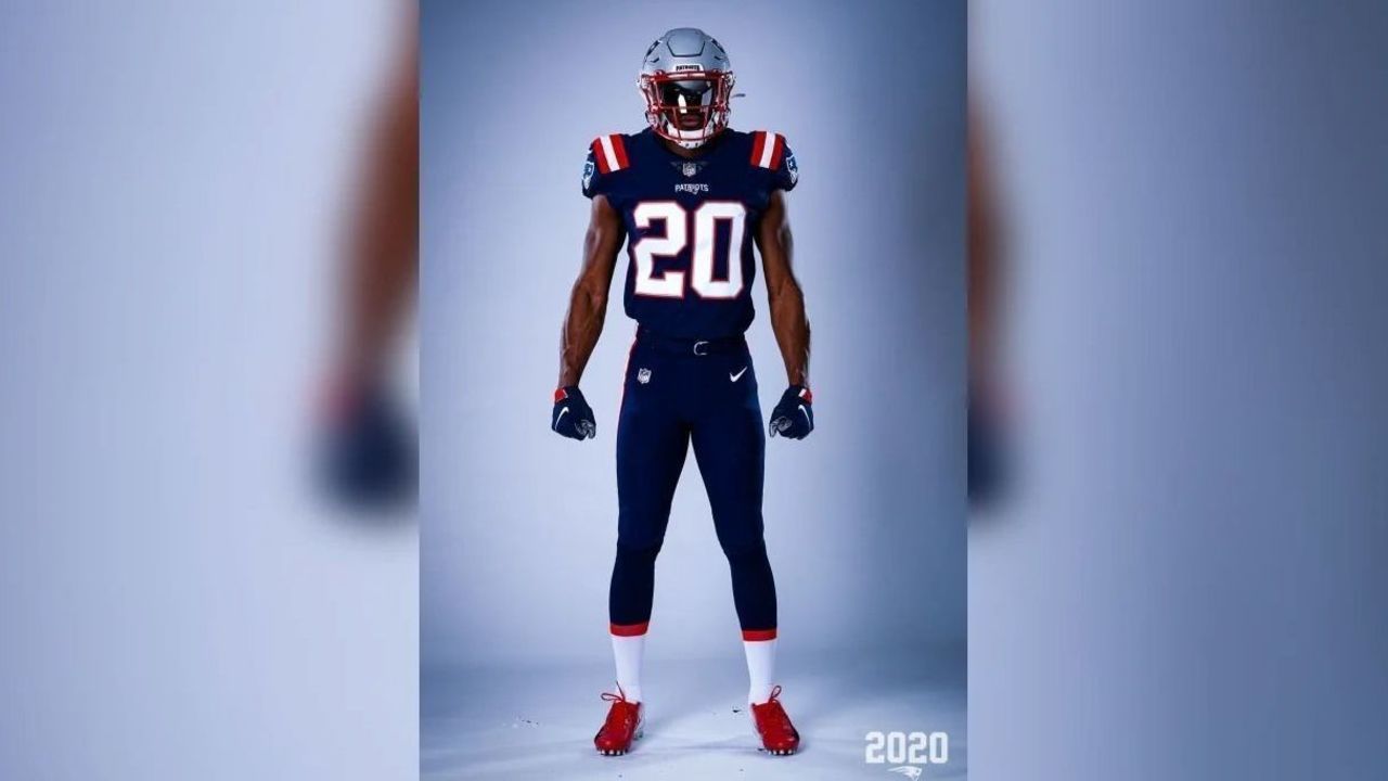
The silver helmet atop navy everything else creates an unbalanced look that's clearly inferior to the navy over silver that Brady wore for so many legendary victories.
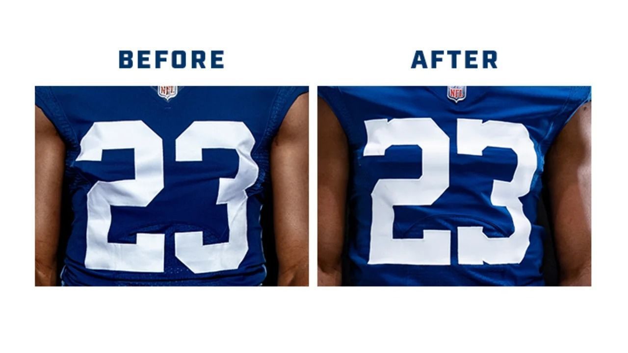
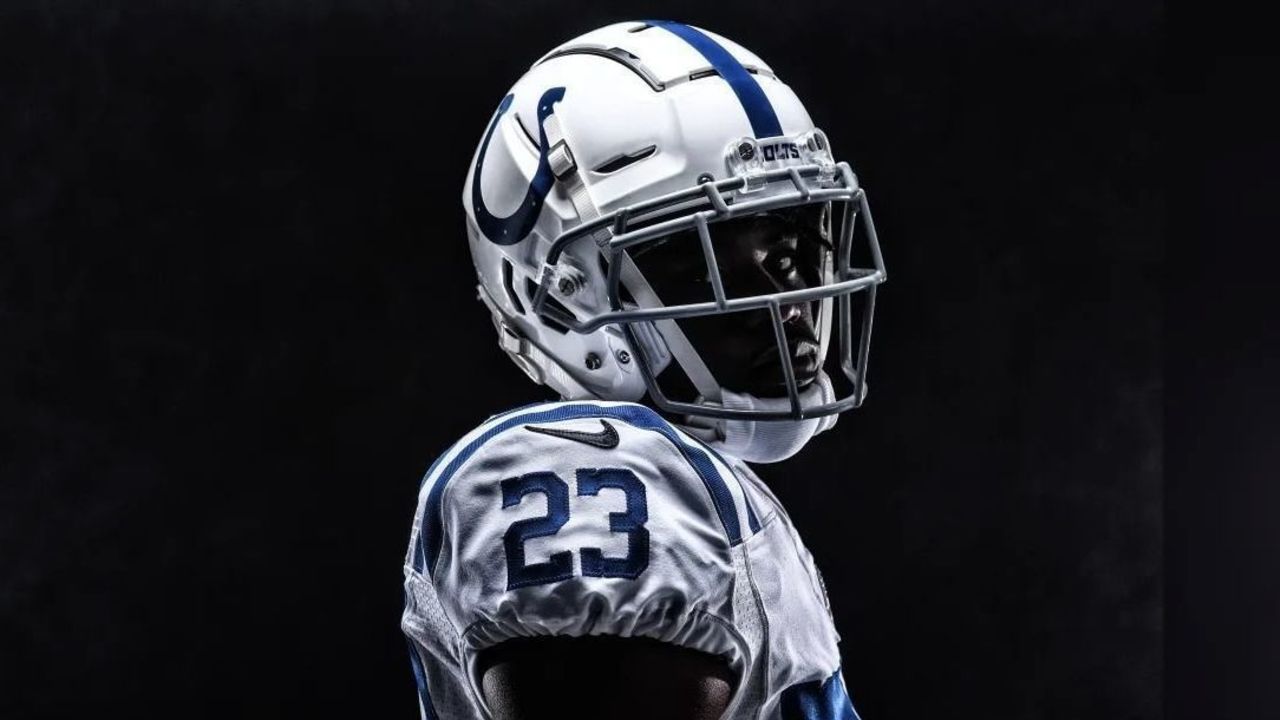
4. Colts
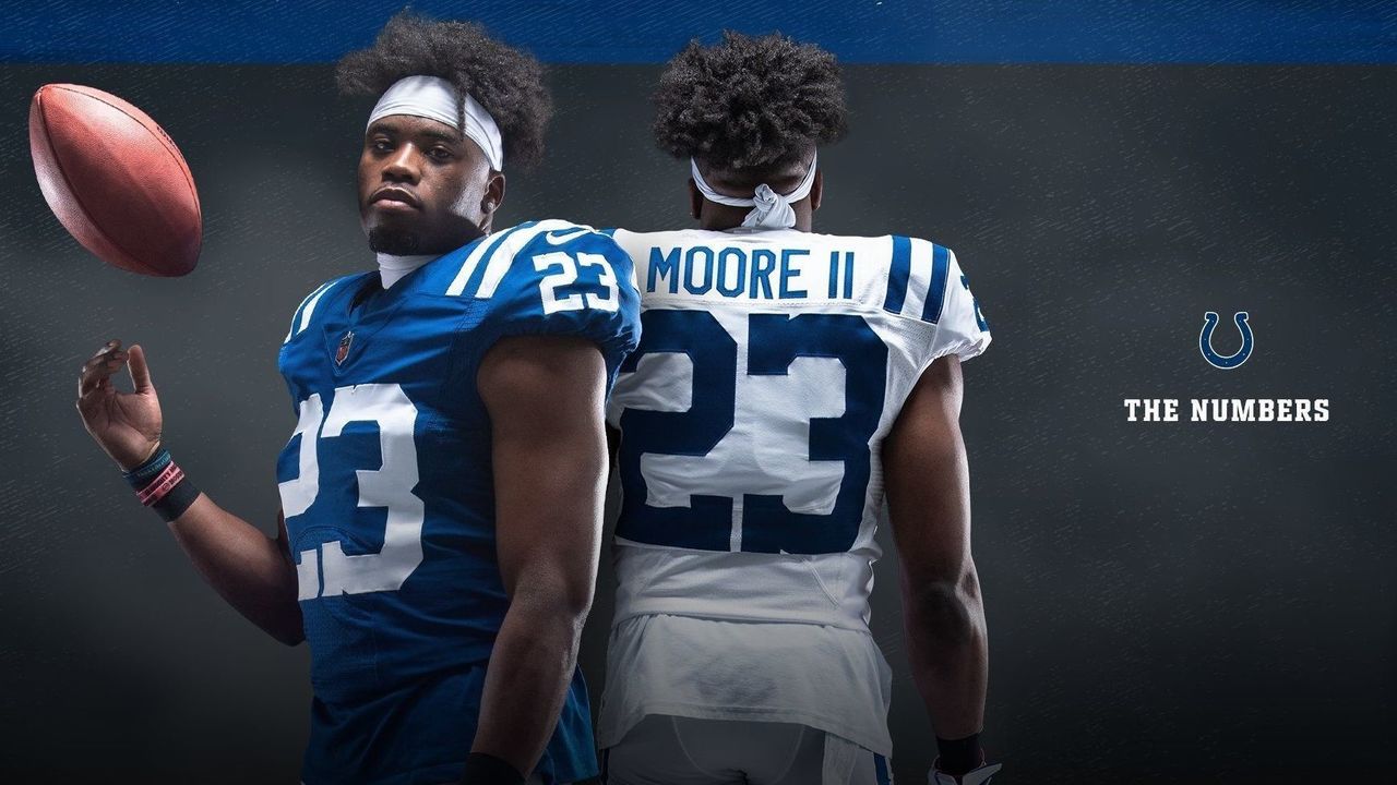
Best element: Retro number font
Worst element: Hints of black added
Maybe it's a little silly to include the Colts on this list. Their "redesign" included little more than the introduction of a new secondary logo and wordmark as well as a change to the number font on the jersey. But they didn't need to change much - already possessing some of the best uniforms in football - and their restraint here is a great example of how less can be a whole lot more when it comes to design.
That serifed number font (borrowed from the team's Color Rush alternate) is a beauty - and a surprisingly significant upgrade over the standard block font the Colts have sported for decades:
Our only gripe with the tweaked jerseys is the introduction of a black Nike swoosh on the road set. This almost certainly portends the introduction of a black alternate jersey in the future. Yuck:
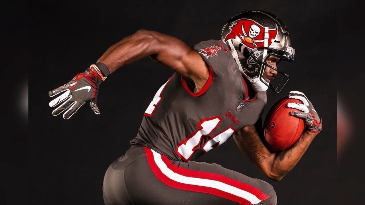
3. Buccaneers
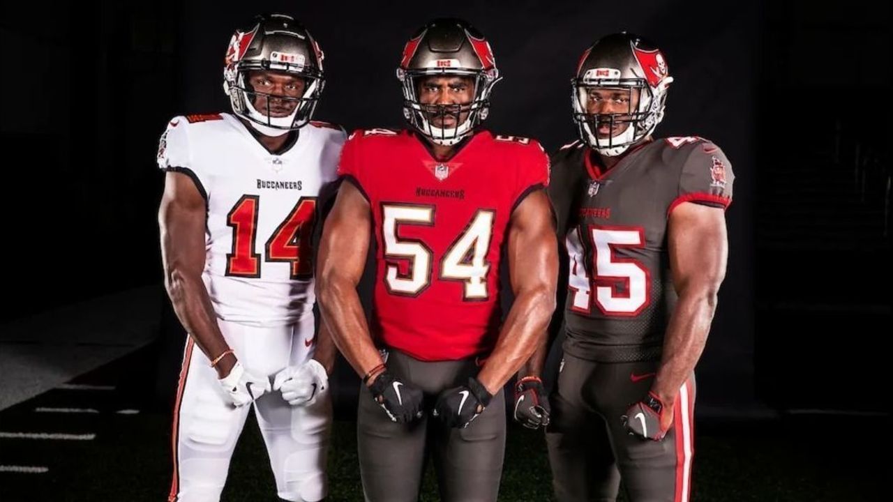
Best element: Return of block number font
Worst element: No creamsicle throwbacks
The Buccaneers acknowledged the major mistake they made five years ago when they overhauled their uniforms under the guidance of Nike. That garish set became known for its glow-in-the-dark numbers that reminded many fans of the digits on an alarm clock.
The moment NFL rules allowed the Buccaneers to ditch that set, they did. Instead of trying something new, they rolled back to a uniform that's almost an exact match of what they wore for their lone Super Bowl title early this century. It's a simple, borderline timeless look.
Thank goodness we won't have to watch Tom Brady finish his career dressed like a clock.
Our biggest criticism with the Bucs' new attire relates to the alternate uniform. The team opted to go with an all-pewter combo, which works well enough:
But we would have preferred to see the Bucs embrace their cult-classic "creamsicle" throwbacks as an alternate. It seems the NFL's one-helmet rule made that difficult, but head coach Bruce Arians says that rule is going away next season, so perhaps the return of a white helmet adorned with the beloved Bucco Bruce is just around the corner.
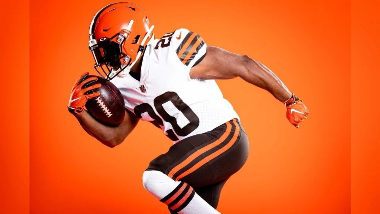
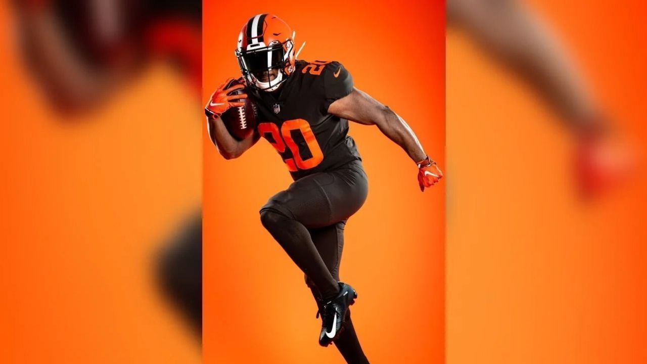
2. Browns
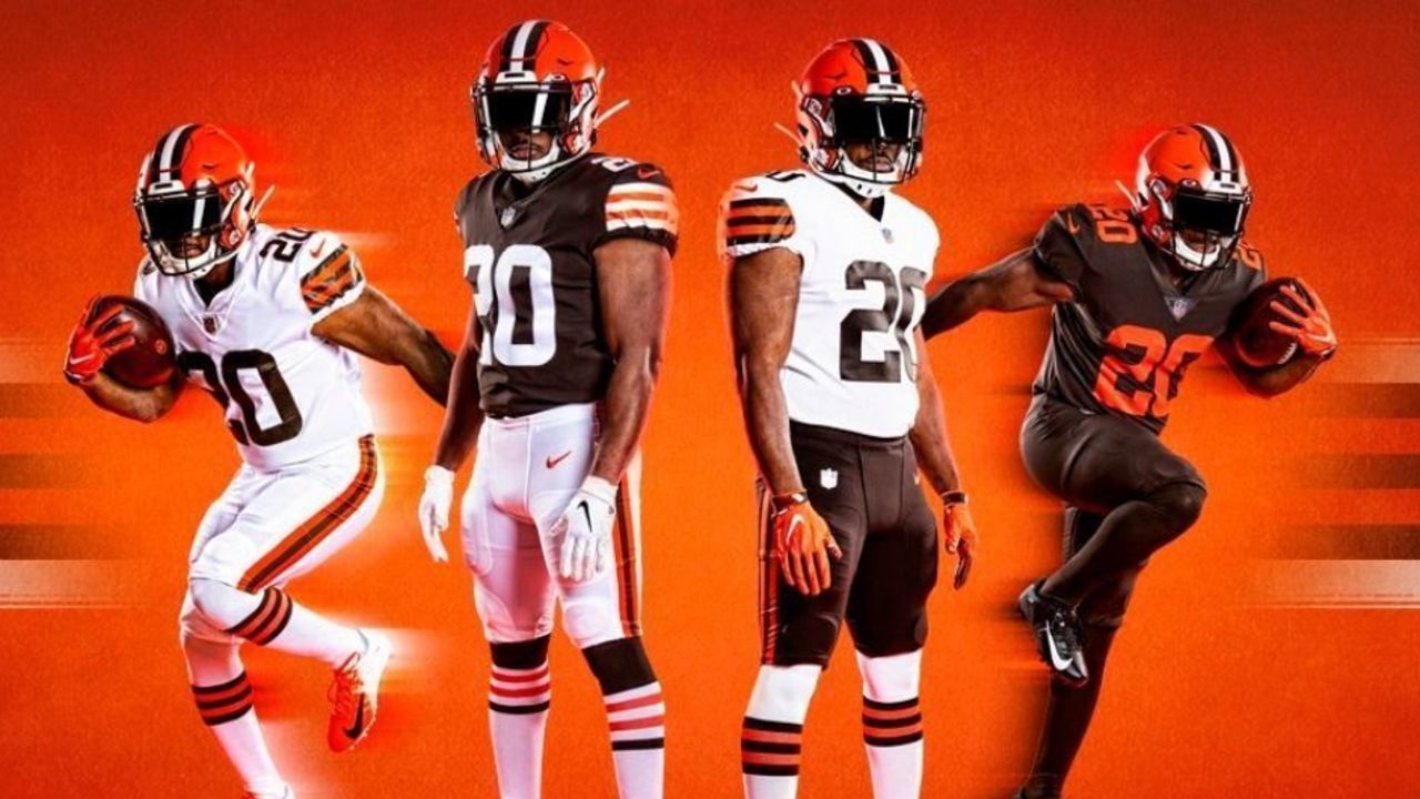
Best element: Stripes on socks and sleeves
Worst element: Bland alternate uniform
Like the Buccaneers, the Browns ditched their despised uniform after the minimum five-year waiting period and returned to a look from their past.
There are some slight tweaks here - like a rounded number font and the addition of brown pants - but generally, the 2020 Browns will look like the Browns of the mid-20th century.
That's a very good thing, as these are among the best uniforms in football. Orange and brown is a unique and vastly underrated color scheme, and the Browns' use of traditional stripes on their sleeves and socks is a breath of fresh air in a world where teams like the Titans, Jets, and Falcons are trying to outdo each other to see whose stripes can be the most jagged:
The only part of the Browns' redesign we can't get on board with is the all-brown alternate uniform. It just looks so plain. We need the stripes!
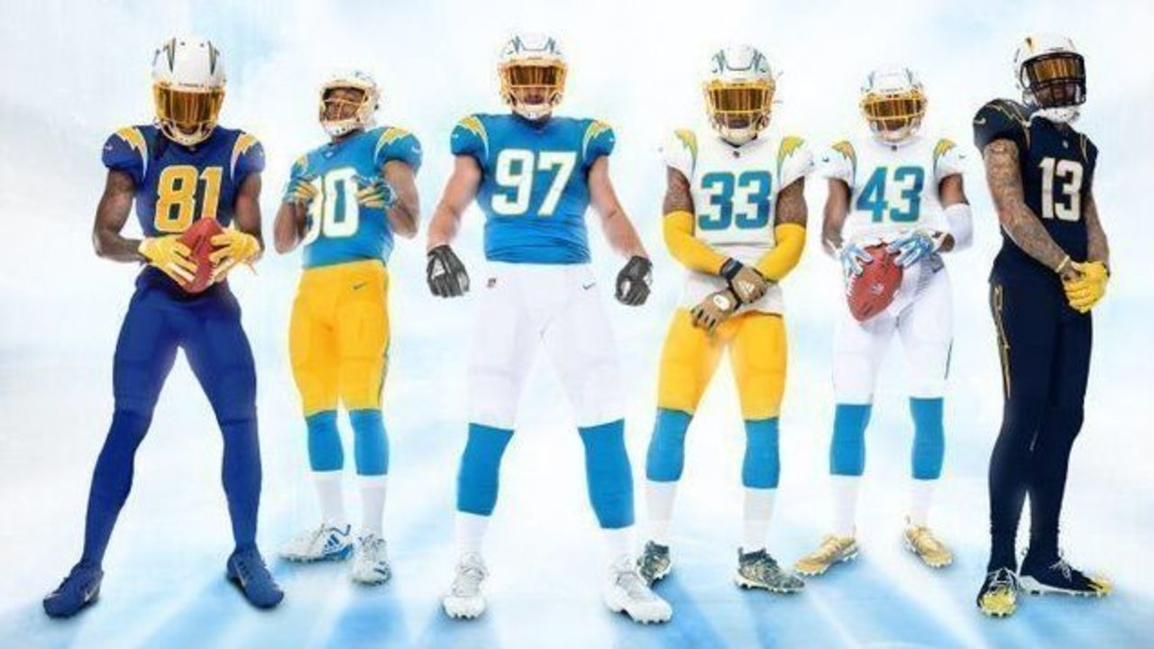
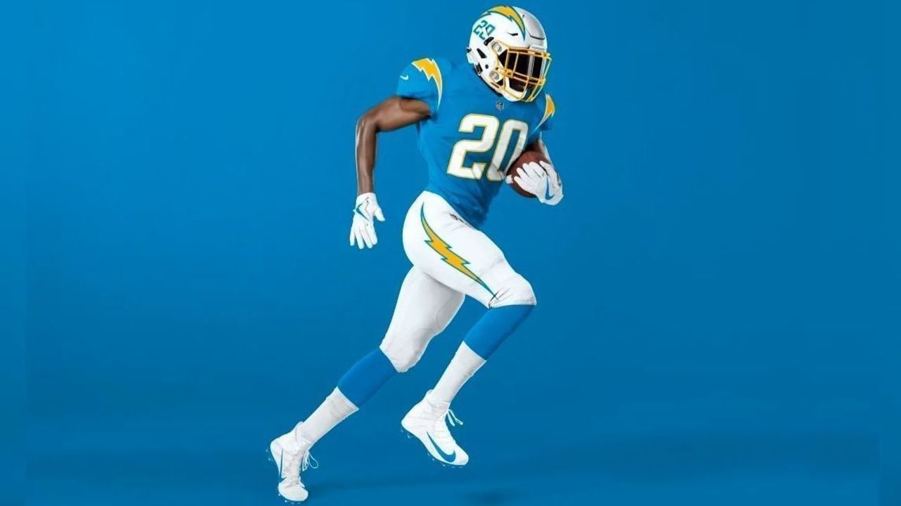
1. Chargers
Best element: Removal of navy blue
Worst element: Modern number font
For a team that's often cited as having some of the best uniforms in sports, the Chargers have actually overhauled their attire far more often than most teams in the GOAT uniform conversation.
Best known is the Chargers' 1960s set, which matched powder blue jerseys with white pants and helmets, all accented by yellow lightning bolts. Then came the 1970s and a move to royal blue jerseys and helmets over yellow pants. In the late 1990s, the Chargers adopted a predominantly navy blue uniform before moving in 2007 to a set featuring both navy and powder blue that attempted to merge all the team's uniform eras.
This latest design is another attempt to merge eras - and it accomplishes that goal much better than the flawed 2007 design did.
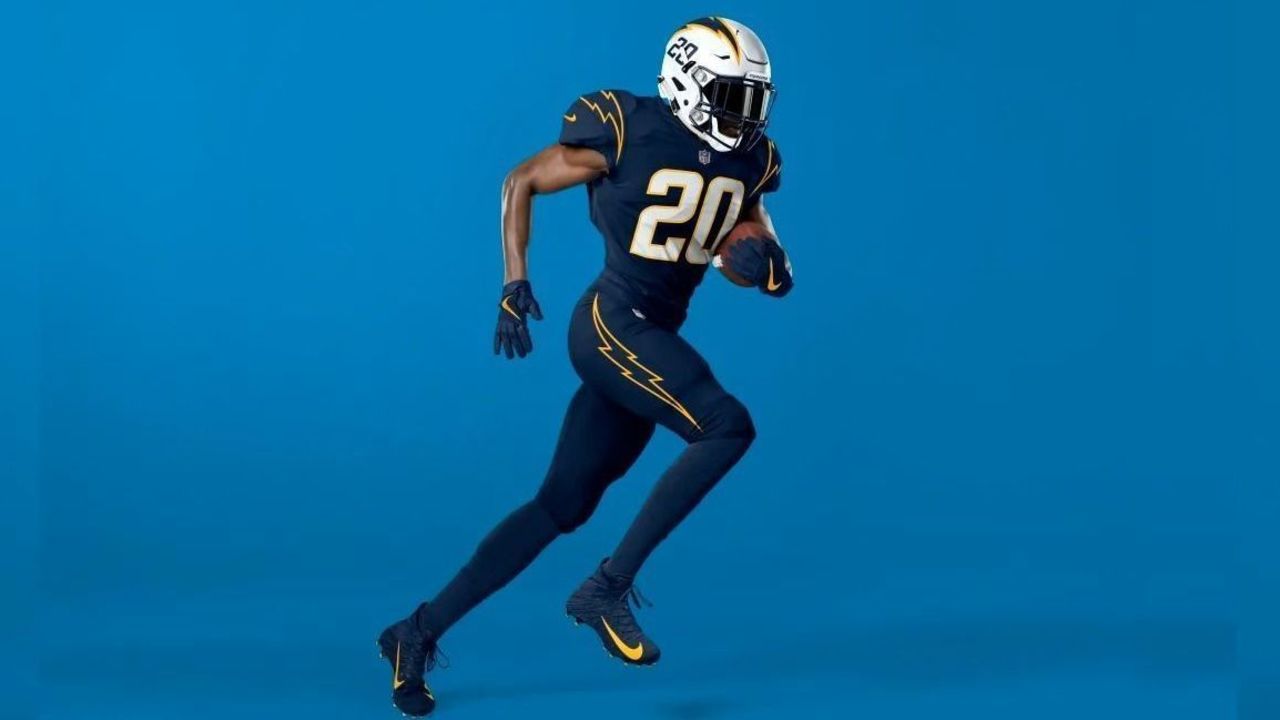
The key here is simplification. The primary set is back to just powder blue, yellow, and white (with interchangeable white and yellow pants), while royal blue and navy blue are contained in throwback-inspired alternate uniforms.
For our money, the best combo in the entire set is the 1960s-esque powder blue over white. This is near perfection:
The navy blue alternate is sharp, and it's poised to get even better next year when the NFL will reportedly allow it to be paired with a navy blue helmet.
If there's a misstep here for the Bolts, it's that a more traditional block-number font might have worked better than the rounded and italicized font they chose.
Have your say
Don't agree with our rankings? Let us know your favorite new uniform in our poll: