The year in uniforms and logos
As 2013 comes to an end it's time to look back at the major logo and uniform rebrands that occurred in pro sports over the past twelve months... it all started in January with the Hornets becoming the Pelicans and it came to an end in December with the Bobcats becoming the, well, Hornets. I guess you could say it was a Hornet-bookended year in the world of logos.
We also saw more one-off charity, throwback, camouflage, pink, patriotic, and "templated" uniforms than we have in any other previous year. We appear to have entered an unfortunate era of seeing our favourite teams trotting out there in close to ten different uniforms a season. There was simply too many of these for us to cover them all in this year-in-review, for the most part we're sticking with the traditional big news items here -- new uniforms, new logos, new identities.
And now, back to the very beginning...
January 2013

The new year got off to a big start with the unveiling of the new logos of the NBA's New Orleans Pelicans; the former New Orleans Hornets, who inherited the Hornets name from the City of Charlotte via a franchise relocation 10 years prior, wanted a name and brand they could call their own. The pelican was chosen due to it's usage as a symbol for Louisiana, appearing on the state flag among other items. The old New Orleans Hornets name, logos, and uniforms were continued to be used by the team until the end of April, they took the court in October as the Pelicans for the first time.

Elsewhere, the Milwaukee Brewers announced the winning design of their "Design a YOUniform" contest, a uniform created by a fan for use by the team in a Spring Training game. The design proved so popular that they ended up wearing it twice during the pre-season. The Buffalo Bisons came out with their new set of uniforms, creating a home and road set which was not based off of any Major League affiliate. Like the Pelicans, they wanted an identity all their own.
February 2013

We saw two new NFL logos in February when the Jacksonville Jaguars and Minnesota Vikings unveiled their new looks, both were slight modernizations of their current logos and would have otherwise gone mostly unnoticed without an announcement. Both teams later unveiled much more noticeable changes to their brand when they released their new uniforms in April.
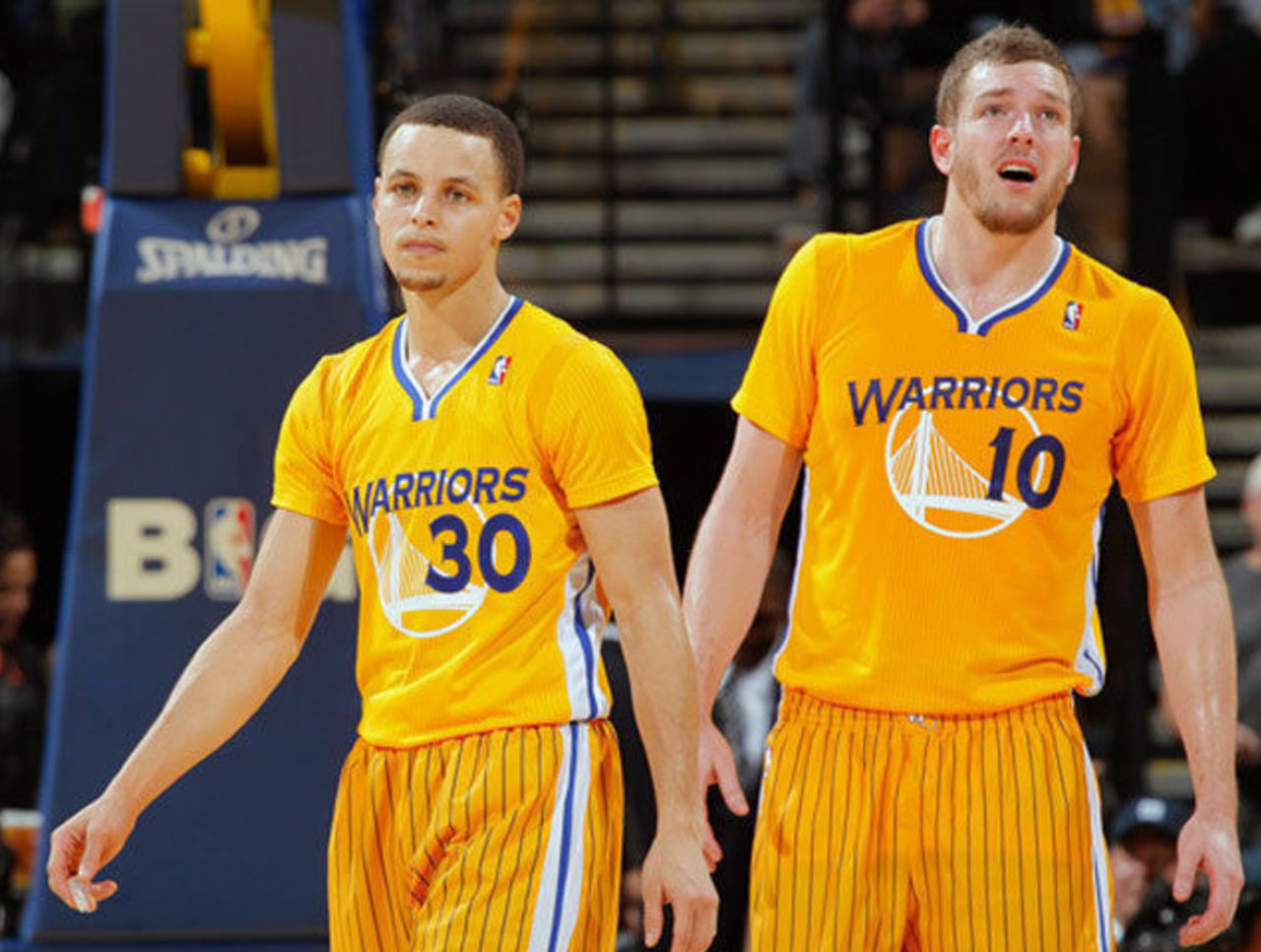
In the NBA, the Golden State Warriors started what would later turn into a uniform-related epidemic in the league when they unveiled their yellow alternate sleeved jersey, the first in NBA history... as we would find out later in the year, it was hardly the last. Unfortunately.
March 2013
The Miami Dolphins, who had confirmed a new logo was on the way earlier in the year, had their new look leaked a month early via a photo on Instagram. The new logo was a simplified version of the classic Dolphins logo, stripping away most of the detail on the dolphin.
Continuing the theme of "looking for their own identity", the WNBA came out with a new logo for the league -- dropping their red, white, and blue shield logo, basically an NBA clone, and unveiled an all new look in an orange and cream colour scheme.
April 2013

We saw three new NFL uniforms within the course of two days in April when the Miami Dolphins, Minnesota Vikings, and Jacksonville Jaguars all unveiled their new looks back-to-back-to-back. Miami's big change was basically the new logo added to their helmet, Minnesota added a custom font for their player numbers, and the Jaguars went all out with a universally panned new helmet which changed shades from black to gold "like a jaguar hiding in the shadows"

In the NHL, the Toronto Maple Leafs and Detroit Red Wings unveiled their 2014 Winter Classic uniforms, both based off of designs of the 1930s. With the Maple Leafs in blue, and the Red Wings in red this set us up for the first dark colour vs. dark colour uniform matchup in a regular season NHL game in nearly 60 years. You didn't miss anything yet, you can still tune in on January 1st for that rare sight.
May 2013
Fans of Roman numerals and asterisks were thrilled when the official logo for the 2018 Winter Olympics in PyeongChang, South Korea was released. The logo, which is not actually a Roman numeral 2 with an asterisk, is an abstract motif of the alphabet of the phoentic Korean language, with II representing "P" and the * for "Ch", the initials of the host city.

On Memorial Day, Major League Baseball teams went full-out camouflage with *every* team wearing uniforms featuring player names, numbers, and team names with a camouflage pattern, and every team except for the Canadian-based, non-Memorial Day celebrating Toronto Blue Jays wearing caps completely covered in camo. As a result of this promotion, May 27, 2013 goes down as the ugliest day in MLB history, easily.
June 2013

An all-new look was introduced by the Dallas Stars at the beginning of the month, a new logo, uniform set, and colour scheme. Gone was the black, gold, and green with the "ST*RS" wordmark as it's central component. In it's place was a return to black and green, but with silver replacing gold, and a new logo featuring a "Big D" (like the nickname of the City of Dallas, get it?) on a silver star.
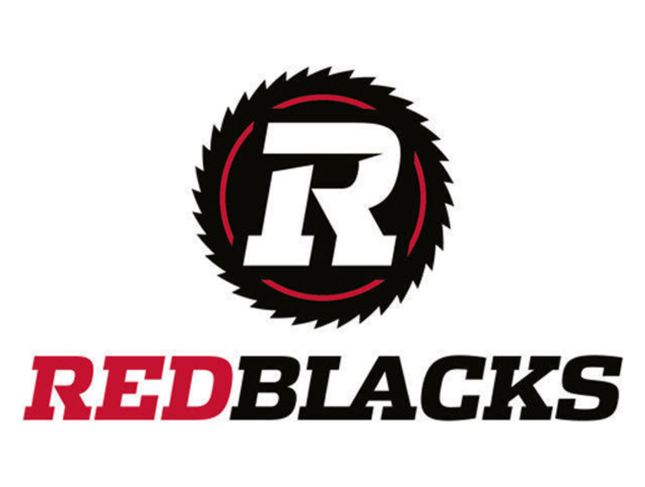
The CFL's Ottawa-based expansion franchise for 2014 had their new name and logos leaked by, um, me... I had just happened to find the Ottawa RedBlacks and their English and French logos registered a little early as a trademark with the Government of Canada. The team officially unveiled the name and their saw-blade inspired logos one week later.
July 2013

Two teams in two sports announced they'd be getting new team names two seasons from now, the NBA's Charlotte Bobcats made every North Carolina basketball fans dream come true when they let us all know they'd be bringing the Charlotte Hornets name back for the 2014-15 season. While in the NHL, as part of their deal with the City of Glendale to keep the team in town, the Phoenix Coyotes agreed to change their name to the Arizona Coyotes, also for the 2014-15 season.

Also in Arizona, a tragic wildfire this month claimed the lives of 19 local firefighters. To help raise funds for those who lost loved ones, the Arizona Diamondbacks created a special black jersey featuring "Arizona" across the front in red and a white patch with the number 19 on it. The Diamondbacks would wear this jersey for their next 10 home games before auctioning them off. The team would continue paying their respects by wearing the "19" patch on every other jersey they wore in 2013.
August 2013

The Phoenix Suns unveiled their new orange-and-black heavy uniforms with a design inspired by their uniforms of the 1990s. The familiar purple, however, was not to be seen anywhere in the new home white, and sleeved orange alternate uniforms but was everywhere on the new road jersey, essentially creating a vastly different colour scheme for home and road games. Also in the NBA, the New Orleans Pelicans unveiled their new uniforms, a fairly disappointing blue and gold set with a tiny wordmark across the chest. What was most baffling was that they went through all that to introduce a new nickname for them only to not use it anywhere on the new uniforms.

In hockey, the San Jose Sharks introduced a new set of home and road uniforms designed with the goal of creating the lightest uniform possible. The team removed almost all striping from the jersey as the extra material required to make these designs added unnecessary weight to their players.
September 2013

Two more sleeved jerseys were added to the NBA as the Los Angeles Clippers introduced their new baby blue alternate and the Golden State Warriors, the ones who started this whole mess, came out with a white version of their yellow sleeved uniforms from the season before.
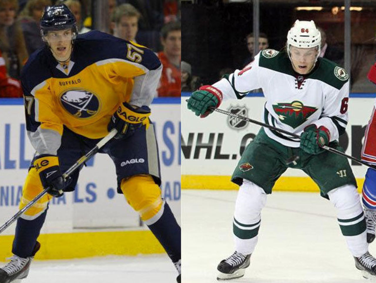
The Buffalo Sabres staged a fake Twitter leak to unveil their new alternate uniform, the new half-yellow, half-blue uniform was instantly labelled by most as one of the worst uniform designs in NHL history. While elsewhere in the league, the Minnesota Wild introduced their new simple, road white uniforms to almost universal praise.
October 2013

Several new 2014 Olympic hockey jerseys were introduced by Nike during the month of October, with the polarizing jerseys for Teams Canada, Slovakia, Finland, Czech Republic, and Sweden all introduced within a few weeks. In an example of templated jerseys, every uniform features the same "faux-lacing" down from the collar and sublimated shoulder designs.

The New York Knicks, San Antonio Spurs, and Calgary Flames unveiled new alternate uniforms, the Knicks going all-orange, the Spurs all-camo, and the Flames with a red and black jersey with "Calgary" across the front. The Knicks would later start off winless in their first six games while wearing the new orange uniforms in 2013/14 before loud calls came from the press and fans to stop wearing them due to their apparent bad luck.
November 2013

Our first new uniforms of the 2014 MLB season were introduced in November, with the New York Mets jumping on the camouflage bandwagon with their new camo alternate jersey to be worn during Monday home games. The Kansas City Royals made a change to their long-used blue alternate uniform, changing the scripted "Royals" for an interlocking "KC" logo like the one on their caps; while the Texas Rangers eliminated the black drop shadow from their "TEXAS" wordmarks on their home and road jerseys.
In the NBA we got even more sleeved jerseys with the announcement of the "BIG Logo" collection, special sleeved jerseys featuring a giant chrome logo on the front, kinda like a hockey jersey in the style of a t-shirt. The new style of jersey is to be worn by several teams, such as the Miami Heat, and New York Knicks, for their games played on Christmas Day this season.
December 2013

The final month of 2013 was dominated by the NHL's Stadium Series uniforms, seven new uniforms to be worn by the Blackhawks, Penguins, Kings, Ducks, Rangers, Islanders, and Devils in four outdoor games in January and March 2014. Each of these Stadium Series jerseys featured a "chromified" logo on the jersey with new design styles such as abbreviated collar lacing, angled sleeve numbers, jagged waist stripes, and elongated numbers on the back.

Finally, as we began the year, we end it with the Hornets, as the Charlotte Bobcats unveiled the logos they'll use in 2014-15 when they're rebranded as the Charlotte Hornets. The new logos did use the old colour scheme of the original Hornets team of the 1990s but with an entirely new design, as per a news-to-me NBA guideline not allowing a team to directly use a previously retired logo as their new primary. The new look has garnered positive reviews so far, scoring a very high 8.4 out of 10 rating on SportsLogos.Net at the time of this post.
In the end, 2013 was a year of designers trying a lot of new things with uniforms -- sleeved jerseys in basketball, "chromified" logos, different spins on hockey jersey collar lacing; whether you like the designs or not, you have to admit they were ideas we had never seen before.
What lies ahead in 2014? Who knows, but I am hoping for a year of less camouflage, and more individuality amongst teams in jersey design for these big league events like the NHL Stadium Series and Christmas Day in the NBA. I'm not holding my breath on either, though.
Happy Holidays everyone.
Chris Creamer is the creator and editor of SportsLogos.net. You can follow him on twitter at @sportslogosnet.