
Welcome back to your weekly update in the world of sports wardrobe.
The big news in uniforms over the past week was the revelation that the National Football League is now instituting a one-helmet-per-player "recommendation". While on the surface this doesn't seem like anything more than a "who cares?" bit of news, it's what the fans lose because of it that really stinks.
You see, allowing only one helmet per player per season eliminates the possibility of a team wearing any throwback uniform which requires a different coloured shell from that of their regular uniform. New England's classics with the white helmet? So long! Atlanta's red 1980s look? Nice knowin' ya! Dallas Cowboys' Thanksgiving throwbacks? Thanks but no thanks! Yup, the "No Fun League" has struck once again.

Some teams have already made adjustments to their uniform schedules because of the announcement. The Tampa Bay Buccaneers have flat out cancelled their "creamsicle" throwback game, originally scheduled for this Sunday, because the helmets are white while their regular helmet is pewter (or as everyone else calls it... silver).
Green Bay will wear a yellow helmet, instead of the originally planned faux-leather brown, for their 1929 throwback game on October 20th, and St. Louis will simply wear a mismatched helmet colour (modern dark navy blue instead of the actual lighter shade of 90s royal blue) when wearing their throwback jerseys.
Yes, the Chicago Bears and Buffalo Bills both wore throwbacks during week two, but they didn't require new helmets to do so. Chicago simply peeled the "C" logo decals off from the sides of their players helmets leaving nothing but a blank blue shell - the team also installed grey facemasks, replacing the standard blue, for the one game. Buffalo also just removed their logos from the helmets replacing it with their 60s stationary red bison graphic. The basic formula is: Same colour helmet shell = throwback fun can continue.
While the policy is in place for the sake of player safety I find it awfully hard to believe in a league which generated $9.5 billion worth of revenue over the 2011-12 season they can't fork the bill to allow a player two sets of fitted helmets for a season instead of just one.
The NCAA and their football teams clearly have no issue with this, we've seen some schools out there in 3 or more different helmet designs per season. Same story in the CFL where several teams are wearing two completely different helmets throughout the year. Why can't the NFL figure this one out? Such a shame...

Moving on to Major League Baseball, the season may be in it's final week but that hasn't stopped two teams from adding memorial patches to their jerseys.
The Seattle Mariners owner, former Nintendo president Hiroshi Yamauchi, ran out of 1-Ups last week and the team paid tribute by adding a black circular patch with his initials "HY" in white to the sleeve of their home, road, and alternate jerseys.
The Mariners will continue to wear this patch for the remainder of the 2013 season, when it'll be "game over" as well for the 2013 version of the team.
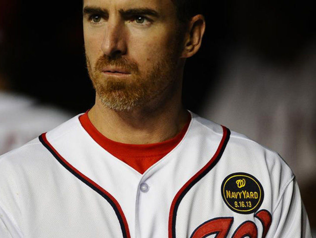
In Washington, the latest mass shooting has the Nationals paying respect with a special Washington Navy Yard memorial patch. The patch, a navy blue circle with the Nats logo and date of the tragedy, was originally placed over the players heart but moved to the jersey sleeve after just one game.
The Nationals also honoured the victims by wearing Navy Academy baseball caps during batting practice before their afternoon game on September 17th, the day after the shootings. They weren't allowed to wear them during the game due to a league policy... silly, right?
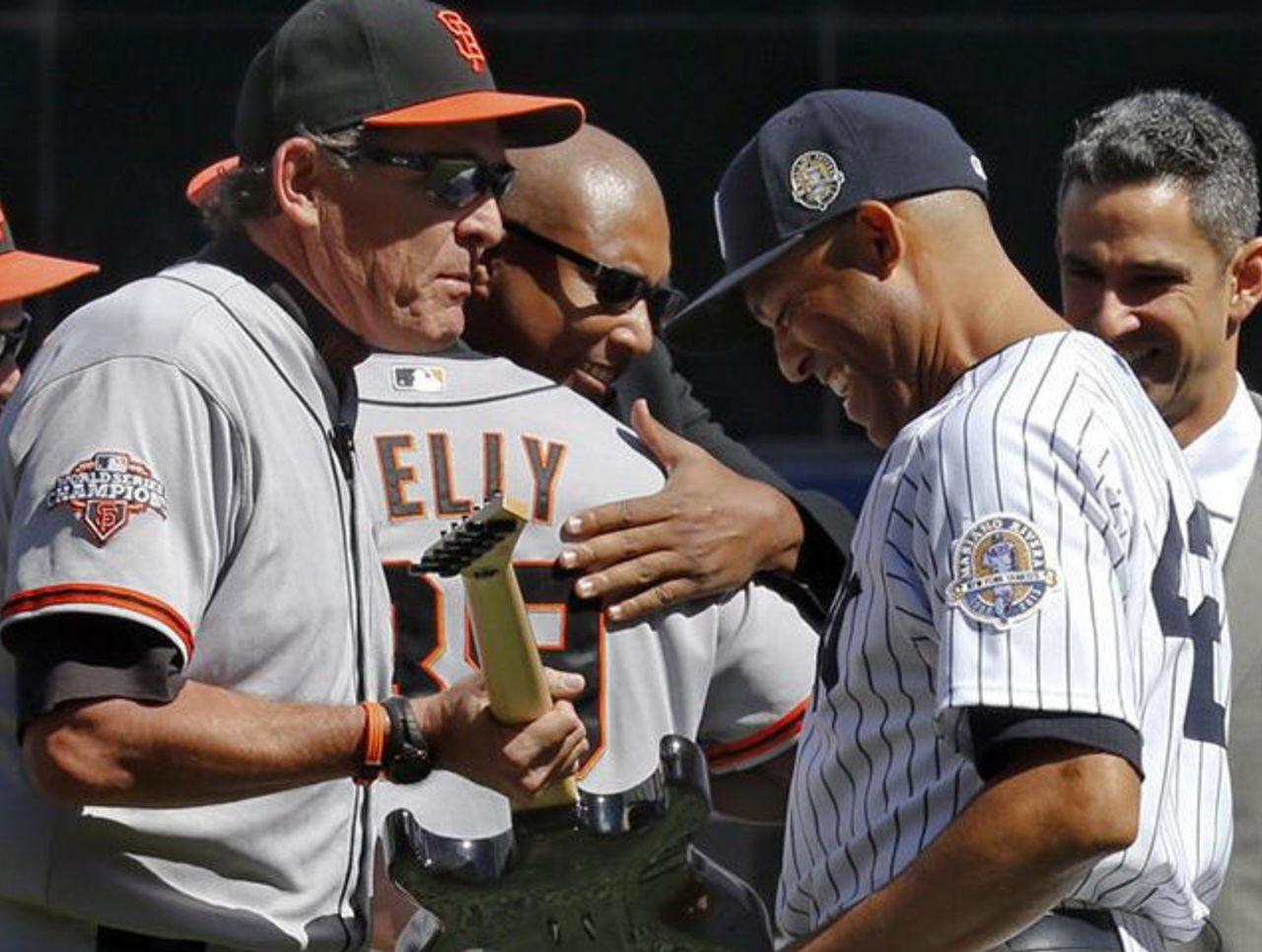
It's not a memorial patch, per se, but in case you've been living in a shoe box, or maybe Wyoming, you may have missed that Mariano Rivera's career is coming to an end this week.
The New York Yankees honoured his long career by wearing a special patch on both their jerseys and caps depicting their closer running in from the bullpen. This is the third time that I can recall a team wearing a patch honouring a player on the active roster. In 2001, the San Diego Padres wore a Tony Gwynn patch while the Baltimore Orioles did so for Cal Ripken, Jr., both for the final games of those two legendary careers.
Starting next month, for the first time ever, we will see postseason patches on the jersey sleeves (and, like in 2012, the sides of the caps) of every team to qualify for the MLB playoffs.
Typically teams would only get a patch upon making it to the World Series. The tradition of wearing a World Series patch started back in 1987 when the St. Louis Cardinals affixed one to the sleeves of their jerseys during the '87 Fall Classic, since then every World Series team has worn the World Series patch during the championship series.
With this week we also saw some teams clinching division titles which gave us our first looks at the templated championship logos the league has created this season. The 2013 championship logos are re-coloured based on the actual colour scheme of the winning team, unlike the logos of years past.
The logos this year feature a single pennant with the cap logo of the team above the championship the team won in the same font as the postseason logos this year. I've seen the logos for every team right through to the end, they all look exactly the same, division titles, league titles, World Series title... just change the words and you've seen the logo. Oh, uh, spoiler alert.

In basketball the Los Angeles Lakers continued to forget they once had a sacred uniform history by introducing a black "Hollywood Nights" jersey which will be worn several times during the upcoming 2013-14 season.
The uniform is essentially their yellow home but with black in place of the yellow. The team says they've been hearing from their fans for years that a black jersey was desired and this is for them, as well as a nod to the numerous celebrities that attend their games... I guess that's where the "Hollywood Nights" part comes into play.
In the hockey world the Anaheim Ducks, the swingers that they are, officially swapped their logos around during the off-season but didn't bother to make any sort of announcement about it. Their alternate logo, the duck foot in the shape of a "D" is now the new primary logo.
The wordmark "Ducks" logo which is on the home and road uniforms is now nothing more than a "secondary logo". I contacted the club when I caught wind of the change and was told that despite the change of logos their uniforms will remain the same. So, alternate logo becomes primary, primary logo becomes alternate, alternate logo goes on primary uniforms, primary logo on alternate uniforms. Got it?
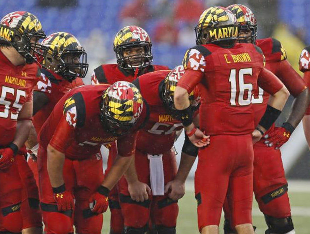
Wrapping things up this week with the NCAA, we saw the University of Maryland take on West Virginia wearing their "Maryland Pride" uniforms. The uniform featured a helmet design dominated by the (amazing) state flag of Maryland waving in the wind encompassing the entire front 3/4 of the shell, on the back a graffiti style "Maryland" wordmark.
I could have done without the wordmark on the back, and the all-red jersey/pants combo that was paired with it, but I absolutely loved that wavin' state flag all over the helmet. I usually hate that modern stuff...
That's all for now, be sure to check back in next Tuesday.
Chris Creamer is the creator and editor of SportsLogo.net. You can follow him on twitter at @sportslogosnet.


