This week we saw two Major League Baseball teams have their logo changes leaked, both teams were making the exact same change to their brand... but how they and the world handled the news couldn't have been more different between the two clubs.
The Pittsburgh Pirates and Cleveland Indians were the two clubs to have their logo re-assignments made public earlier than they originally planned, both teams were upgrading one of their cap logos to the status of "primary logo", replacing a logo which has been around for over a decade and had never been worn during a world championship season. Both replaced logos would remain on the team uniforms in the exact same manner as in previous seasons, the re-assignment was merely for how Major League Baseball categorizes logos for merchandisers and media types.

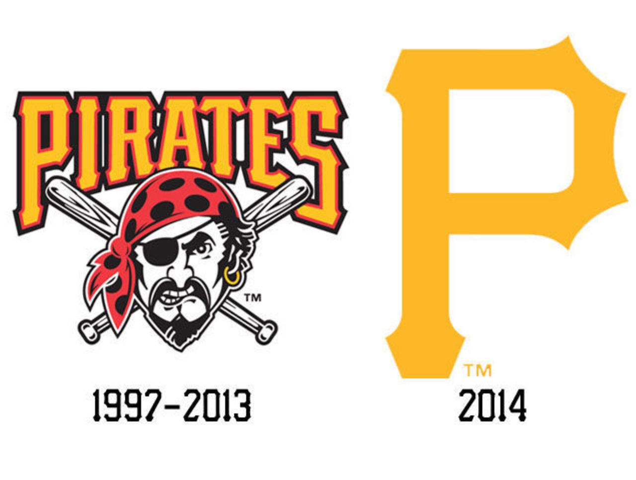
Pittsburgh's gold-P logo, first introduced in the late 1940s and worn on their ballcaps ever since is now the primary logo, replacing the "Jolly Roger" logo - a pirate wearing a red bandana with crossed baseball bats behind it, used by the club since the 1997 season. The news was tweeted out by a local baseball reporter (a full month after we reported it, by the way) and the club eventually released a statement on twitter explaining the what's and the why's for the change:
For those asking: The Pirates have changed our PRIMARY logo to the Gold 'P' for reasons such as merchandise, marketing, etc. We will in fact be keeping the Jolly Roger art as a patch on our unis & look forward to getting to raise it many times in 2014!
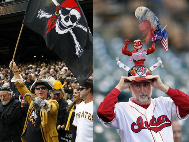
Fan reaction was fairly muted, there was certainly no outrage over the demotion of the "Jolly Roger" to secondary status.
Cleveland, on the other hand, did things fairly differently.

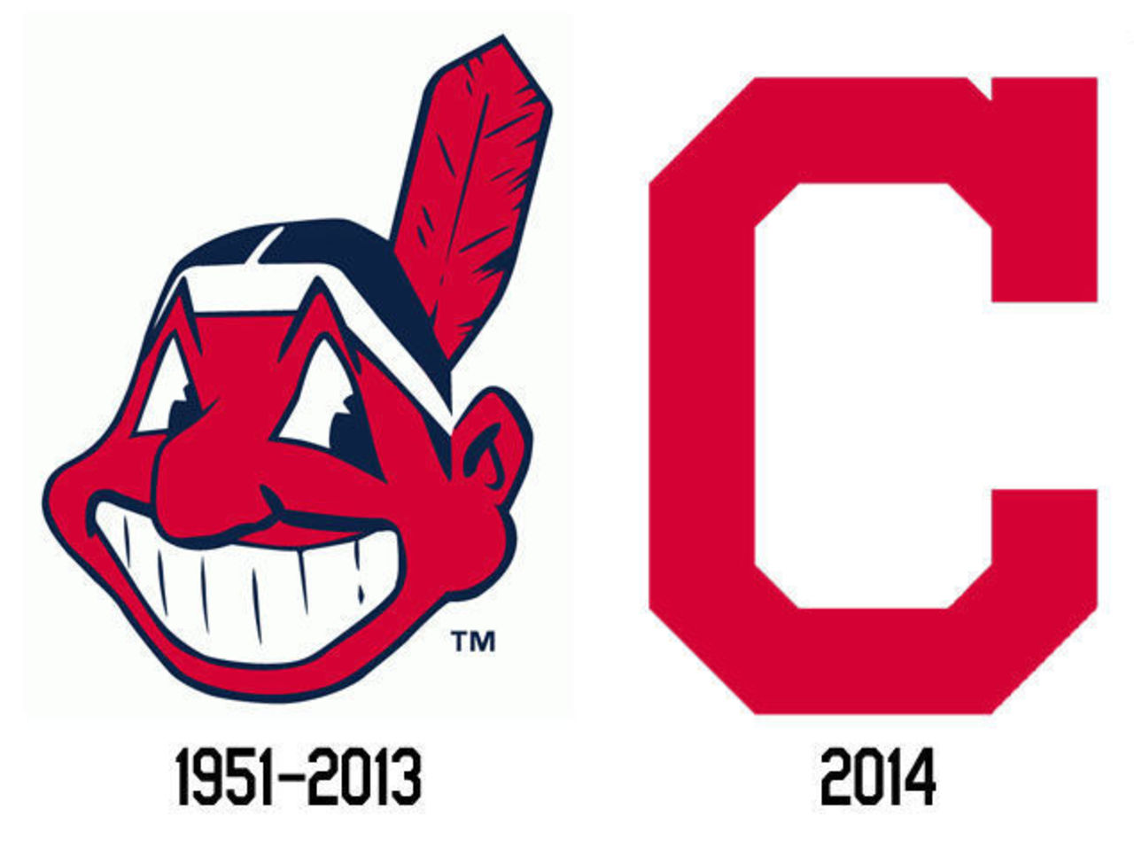
The Indians, like the Pirates, promoted their cap logo, a red block style C with a serif, worn on their road caps and alternate caps for 6 years now, to primary logo status. Getting the demotion is "Chief Wahoo", the polarizing logo which has been present on the Indians branding in one way or another for the better part of seven decades. Like the Pirates, the demoted logo remains on the uniform as it had in previous seasons, no change there.
While the Pirates readily made the change official and explained why, the Indians quickly denied that anything was happening to Chief Wahoo with some Cleveland media outlets erroneously reporting the initial Tweets discussing the news of the logo swap were themselves "erroneous".
Apparently the Indians were responding to cries about Wahoo being eliminated from the uniform, which, as had always been reported by everyone, is not happening. Buried deep within just one of those articles (and seemingly glossed over by the writer) was the confirming quote from Indians director of communications Curtis Danburg:
It's a nature of changing the designation that you might see that Major League Baseball uses in their style guide, which is more of a discretionary change.
It was like pulling teeth, but you finally got it ... and that's the only confirmation you're going to get from the Indians -- we've been told that the team will not be making an official announcement regarding the swap. Hoping nobody notices, I guess... seems like a fairly cowardly decision, doesn't it?
Fan reaction was slightly more unsettling than what we saw in Pittsburgh.
"Wahoo isn't racist, only racists think its racist"; "Free Chief Wahoo!!! This is assinine!"; "Who cares if it offends you. It's been their logo since 1951... deal with it.". Just some of the gems we saw. The rest expressing disappointment that the "C" logo is just too boring to be a primary logo.
One fan summed it up quite nicely:
Odd folks have a problem with a basic C, but no problem with the Pirate's basic P.
Yes, odd. Almost as if there's something more being lost in this logo swap to a certain group of folks out there than a simple logo re-assignment like the one we saw in Pittsburgh.

In the past I've tried to keep my opinions on these controversial topics to myself, focus more on reporting what's happening, but it really is time for this club to make a change.
The only valid reason I could accept for keeping a logo like this is "the logo is meant to honor Native Americans." Okay. That's fine, honoring a group of people who've gotten a raw deal is a nice gesture. However, it would appear a large amount of Native Americans are, in fact, offended and not honored whatsoever by your gesture.
This is when it's time to make a change.
Just think about it in a more personal situation. If you gave a gift to someone you cared enough about that you wanted to pay homage to them and it only ended up offending them, would you then tell them to keep their complaints to themselves and force them to keep it? Absolutely not, unless you were a dick and trying to offend them intentionally. Chances are, as a responsible human being, you'd likely apologize profusely and get them something else to honour them properly and respectfully.
While the Indians continue to insist that their Chief Wahoo isn't going anywhere it clearly is. In the past ten years, Chief Wahoo went from the primary brand of the club, worn on everything -- the home, road, alternate, and batting practice jerseys AND caps to being designated as a secondary mark, and eliminated from the road, home alternate, and B.P. caps. It'll only continue to be slowly removed from the identity of the club... and that's a good thing.
Chris Creamer is the creator and editor of SportsLogos.net. You can follow him on twitter at @sportslogosnet.
